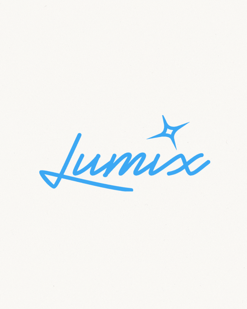
Lumix (Branding & Packaging)
Brand Identity Design · Packaging & Layout Design · Visual Direction · Typography · Logo Design · Label Design


Skincare that speaks softly.
Lumix is a visual identity concept for a skincare line made with sensitive skin in mind, where clarity, calm, and confidence take center stage.
Designed for people with delicate, eczema-prone, or acne-sensitive skin, Lumix explores how visual design can convey softness, trust, and hydration, without sacrificing elegance or simplicity.
BRIEF & GOAL
Most sensitive-skin products feel either overly clinical or visually underwhelming. I wanted to create a skincare system that feels soothing, trustworthy, and beautiful, like a cool breath of calm.
MY SOLUTION
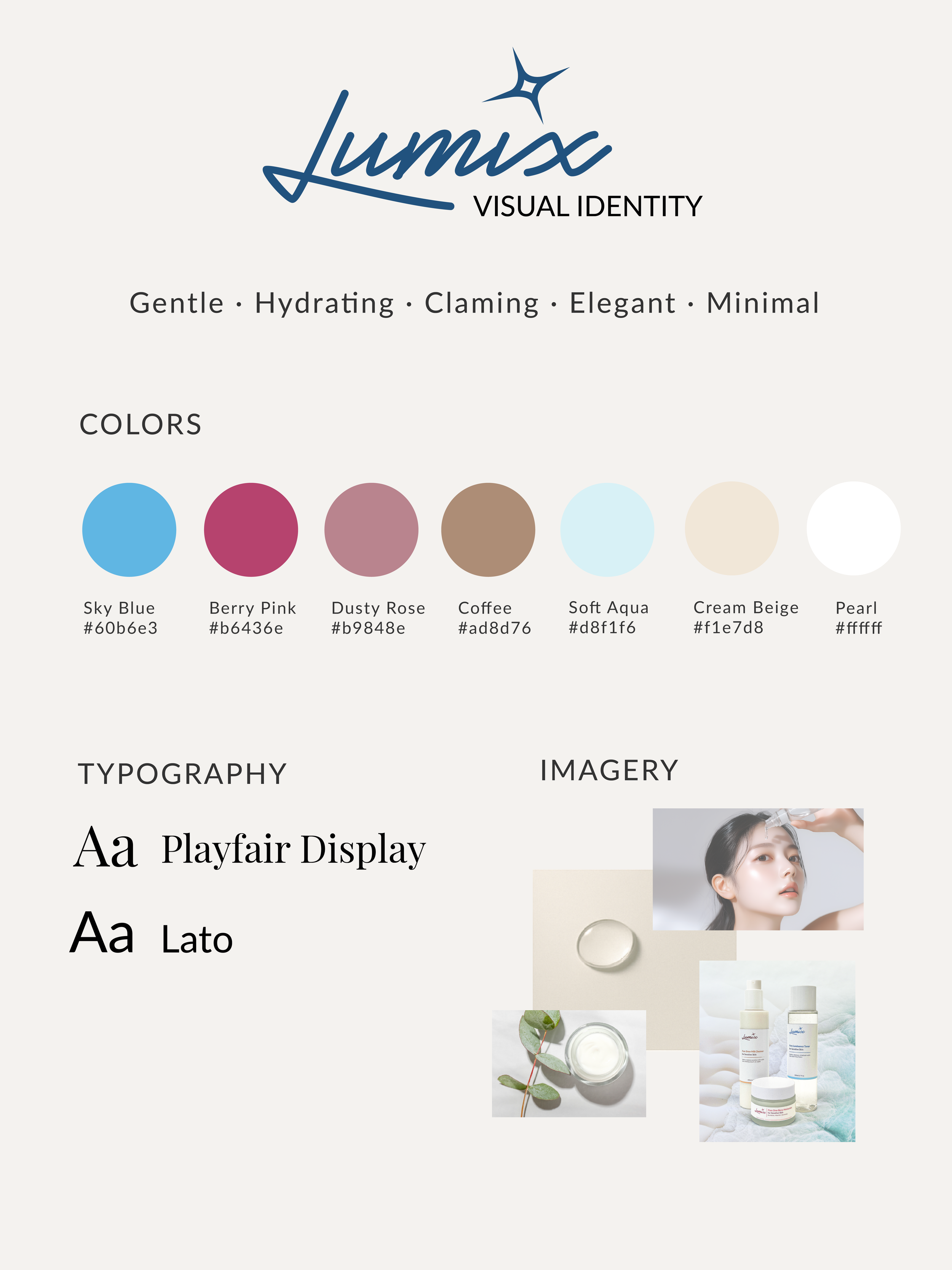
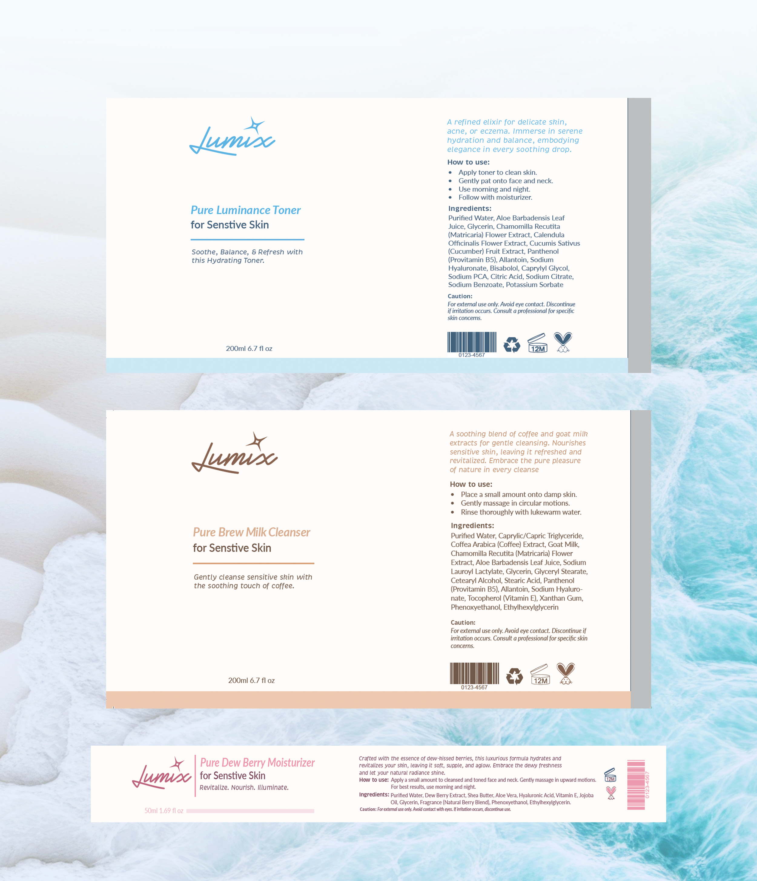
A soft, water-inspired identity system with minimalist packaging, color-coded accents, and intentional white space, designed to feel as gentle as the products themselves.
Social Media Assets

Visual Identity
Reflection
Designing Lumix was all about finding that balance between gentle and luxe. I wanted the brand to feel calming and trustworthy, like something you’d actually want to use on sensitive skin. I drew inspiration from textures like water and soft light, and tried to make everything feel cohesive, from the labels to the social media posts.
It was fun figuring out how to keep things looking clean but still playful. I leaned into soft colors, handwritten touches that still felt elevated. If I had more time, I’d explore outer packaging mockups and perhaps some web design to bring it all together.

More of My Design Adventures
-
![]()
Case Studies
Check out my case studies!
-
![]()
School of Arts, Communication, and Languages Logo
Client Work · Visual Design · Logo Design · Branding · Typography
City College of San Francisco’s School of Arts, Communication, and Languages logo capturing creativity, diversity, and inclusion.
-
![]()
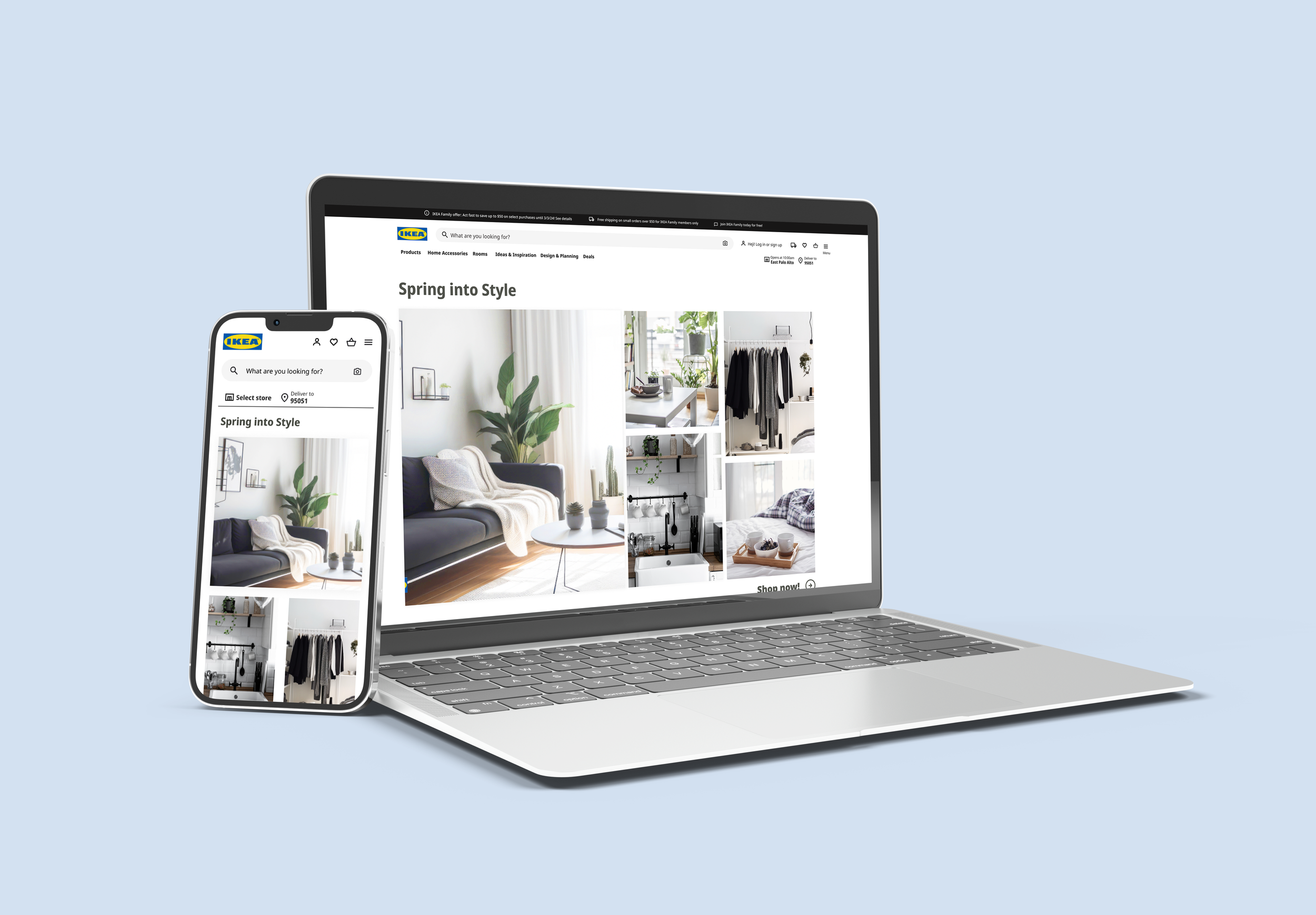
Spring into Style with IKEA
UX/UI Design · Design Systems · Responsive Design · Marketing
Conducted user and competitor research to create a social media campaign and a responsive webpage for IKEA's Spring Refresh Campaign, including an Instagram post, social media content, and a responsive landing page to engage customers during the peak furniture-buying season.
-
![]()
Masterworks Chorale Winter Concert
Client Work · Visual & Graphic Design · 3d Illustration · Typography
Designed a poster and assets to promote and enhance engagement for the Masterworks Chorale’s Winter Concert
-
![]()
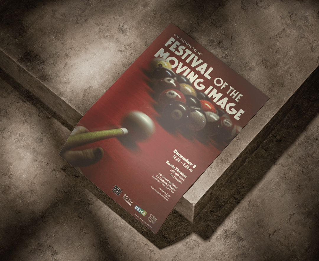
Festival of Moving Images Poster
Client Work · Visual & Graphic Design · Typography
Poster for the City College of San Francisco’s Festival of the Moving Image showing the outstanding media work of students in the Broadcast Electronic Media Arts and Cinema programs.
-
![]()
City Shorts Film Festival Poster
Client Work · Visual & Graphic Design · Illustration · Typography
Poster for the City College of San Francisco’s Cinema Department City Shorts Film Festival.
-
![]()
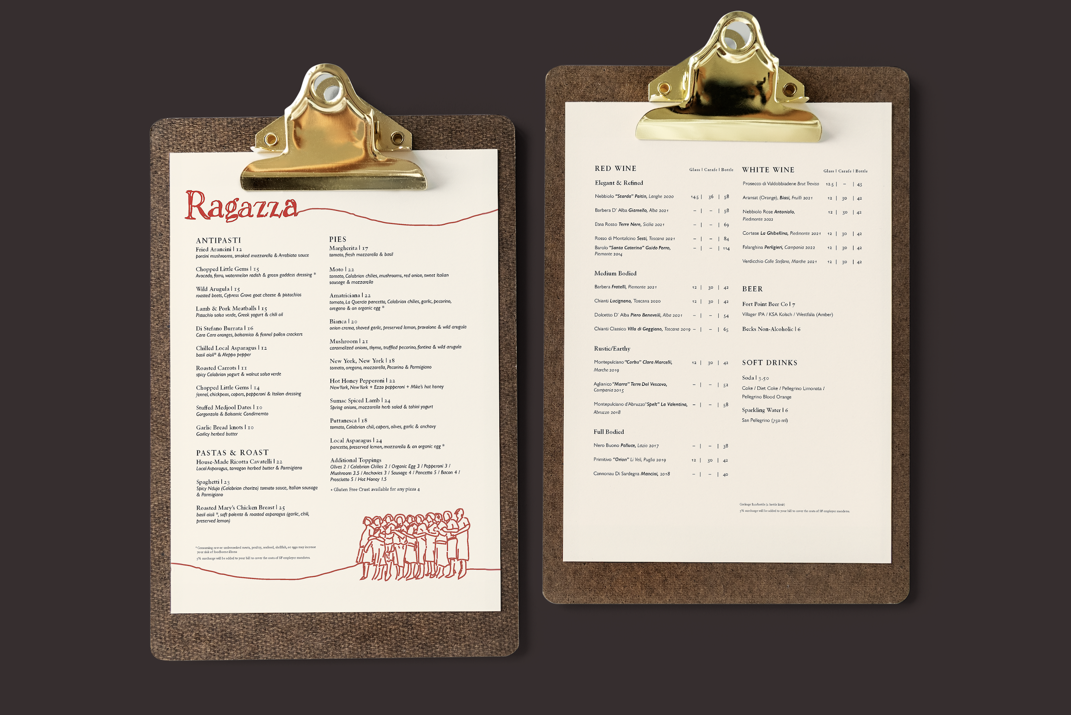
Ragazza Menu Redesign
Visual & Graphic Design · Typography · Branding
Ragazza is a beloved Italian restaurant in San Francisco, this menu design is to enhance the dining experience and reflect the resturant’s warm, inviting atmosphere.
-
![]()
Social Media/Marketing Design
Visual Design · Marketing · Branding · Social Media · Engagement · Motion
Some of my favorite social-first graphics and campaign pieces that that drive clicks and likes.