The Alvarado Project Website Redesign
Making History Clickable.
As someone passionate about design for community and education, I was excited to lead this project for The Alvarado Project (TAP), a nonprofit preserving Filipino-American history. Their outdated website was confusing and hard to update, limiting outreach and donations.
Working closely with their team, I restructured the site from the ground up, separating TAP’s mission from the founder’s artistic legacy, simplifying navigation, and rebuilding it on Squarespace so volunteers could manage everything, no code needed.
Role
Lead UX/UI Designer
Information Architect
Front-end Implementer
Skills
Wire Framing
Visual Design
Prototyping
Site audits & Information Architecture
User Research & Stakeholder Workshops
Squarespace Setup & Content Migration
Software
Figma
Squarespace
Team
2‑person design team
Timeline
Sept 2024 – May 2025
The problem with the legacy site
TAP’s old website was confusing to navigate and hard to maintain, limiting the organization’s ability to grow.
Navigation was broken
Key content was buried in dropdowns that didn’t work on mobile, frustrating visitors.No clear way to support
The donate button was barely visible, and there was no built-in shop for fundraising.Content went stale
Every update needed a developer, so information quickly became outdated.Unclear messaging
The nonprofit’s mission was mixed with the founder’s story, making it hard for visitors to understand who TAP SF is and what they do.
We needed to rethink the structure, clarify the messaging, and make the site easy for their team to manage going forward.


The solution
We completely restructured the site to make it easier to navigate, easier to update, and more focused on TAP’s mission.
Clarified the structure
We separated the nonprofit’s work from Ricardo Alvarado’s artist story, creating clear sections for the organization, exhibits, and the archive.Simplified navigation
We built a clean, easy-to-follow site map with clear paths to explore programs, learn about the artist, and support the organization.Made donations and shopping front and center
We added a visible Donate button and built an online store for books and merchandise.Set up a no-code editing system
We rebuilt the site in Squarespace, so volunteers can easily update content, post events, and manage the shop without needing a developer.Optimized for mobile,
We created responsive layouts, so exploring the archive, donating, and shopping feels just as smooth on phones as it does on desktops.
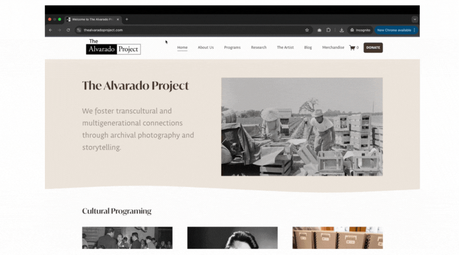
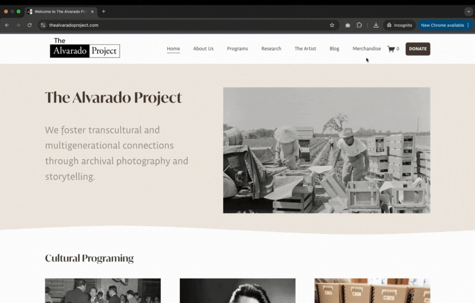
Now, TAP SF has a website that tells their story, supports fundraising, and can grow with them over time.
Key user flows we designed
Learn About TAP and the Artist Flow
Visitors land on the homepage and see clear navigation for About Us and About the Artist.
About Us shares TAP SF’s mission, team, and community impact.
About the Artist tells Ricardo Alvarado’s personal story, featuring photos and historical context.
Visitors clearly understand the difference between the organization’s ongoing work and the artist’s legacy that inspired it.
Explore Programming Flow
Visitors browse cultural programs like “Through My Father’s Eyes” and “Archive X.”
Click to view full program details, photos, and stories.
Donate Flow
Visitors click the Donate button in the header.
Choose an amount and complete the donation in just a few steps.

Shop Flow
Visitors explore the Shop for books and merchandise.
Add items to cart and check out securely.
This is how the site came together , our process
Discovery & Research
We started by running alignment sessions with TAP’s team to understand their goals, audiences, and challenges. From this, we created two quick personas to guide our design decisions:
Personas
Supporter: Someone who wants to donate or buy merch to support the organization.
Curious Visitor: Someone who wants to learn about Filipino-American history and explore the archive.
We also completed a full site audit to document all the content and identify what wasn’t working.

What Wasn’t Working
The old site was messy and hard to use:
Key pages were buried in dropdowns that broke on mobile.
The donate button was easy to miss.
The site map was confusing, mixing programs and org info.
Visitors couldn’t tell what TAP does or how to support them.
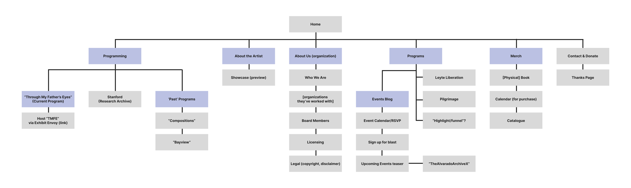
Content Strategy & Information Architecture
One of the biggest challenges we tackled was untangling TAP’s story, making it easier for visitors to understand who the organization is, what they offer, and how to get involved.
We worked closely with TAP SF’s team to restructure the site around two key storylines:
The Organization: TAP SF’s mission, programs, and community impact.
The Inspiration: Ricardo O. Alvarado’s personal story and photographic legacy.
We used card sorting and user journey mapping to define a simple, logical site structure. This led to come up with nine clear navigation sections:
Home
About TAP
Programs
Research
About the Artist
Blog
Merchandise
Donate, Contact
This new structure clearly outlines the path for visitors to learn about the organization, explore programming, and support the project without getting lost in unnecessary pages or dead ends.

Wireframes to Final Design
We started with low-fidelity wireframes to figure out the layout and content first before worrying about the visuals.
Shared early sketches to get quick feedback.
Made sure the structure felt clear and easy to use.
From Wireframes to High-Fidelity
Once the structure worked, we moved to high-fidelity mockups, adding visuals, layout, and real content so the client could see the full picture.
Setting the Visual Direction
We built a style tile to lock in the colors, fonts, and look & feel.
This made sure the site felt warm, community-focused, and on-brand.
We refreshed the look and feel to better reflect TAP’s mission
Colors
Warm neutrals with soft accents to complement the photography.
Typography
Serif headlines with clean body text for a modern, editorial feel.
Calls to Action
Clear Donate and Shop buttons to guide visitors to take action.
Style Tile
No-Code Build & Handoff
We built the site on Squarespace so TAP’s volunteer team could manage it on their own:
Reusable sections for adding new programs, events, and merch.
Training resources like walkthrough docs and Loom videos.
Built to grow with their content and community.
Final Outcome
TAP’s new website makes it easier than ever for visitors to explore cultural programs, learn about Ricardo Alvarado, and support the organization’s work. The site is clean, easy to navigate, and simple to manage freeing up the TAP SF team to focus on building community through art and storytelling.


Reflection
This project wasn’t just about fixing a broken site, it was about empowering a grassroots org to tell their story and grow.
I learned how much thoughtful structure and accessibility can impact small teams: the TAP team now has a flexible system that they fully own. I’m proud of how we balanced strategy, usability, and visual storytelling to support their mission.
Projects like this remind me why I switched into design to make tools and experiences that meet people where they are, and actually make life a little easier.
Why This Matters
Nonprofits often don’t have the time or resources to manage complex websites. We designed a solution that works for their visitors and their team, making it easier to explore, donate, and grow their impact without needing technical help.
What We Achieved
Increased engagement: Visitors now explore more pages and stay longer.
Simplified donations: A clear, front-and-center Donate button makes giving easy.
Enabled growth: Volunteers can now update the site themselves, saving time and money.
I’m proud of how we balanced strategy, design, and real-world impact, and I’m excited to bring that same mindset to my next team, helping organizations create experiences that work for people and meet business goals.

More of My Design Adventures
-
![]()
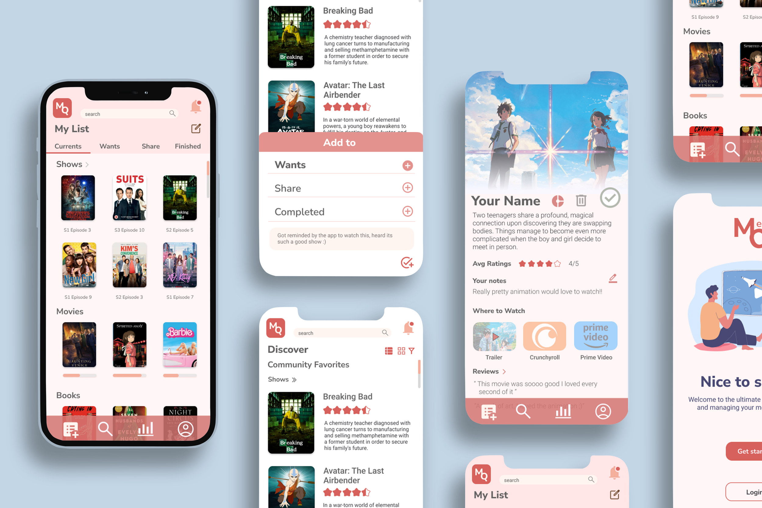
MediaQ
Product Design · UX/UI Design · Branding · Interaction Design
A simple, organized way to keep track of the movies, shows, and books you’re into. MediaQ lets you sort what you’re watching, what’s next, and what you want to share, all in one place.
-
![]()
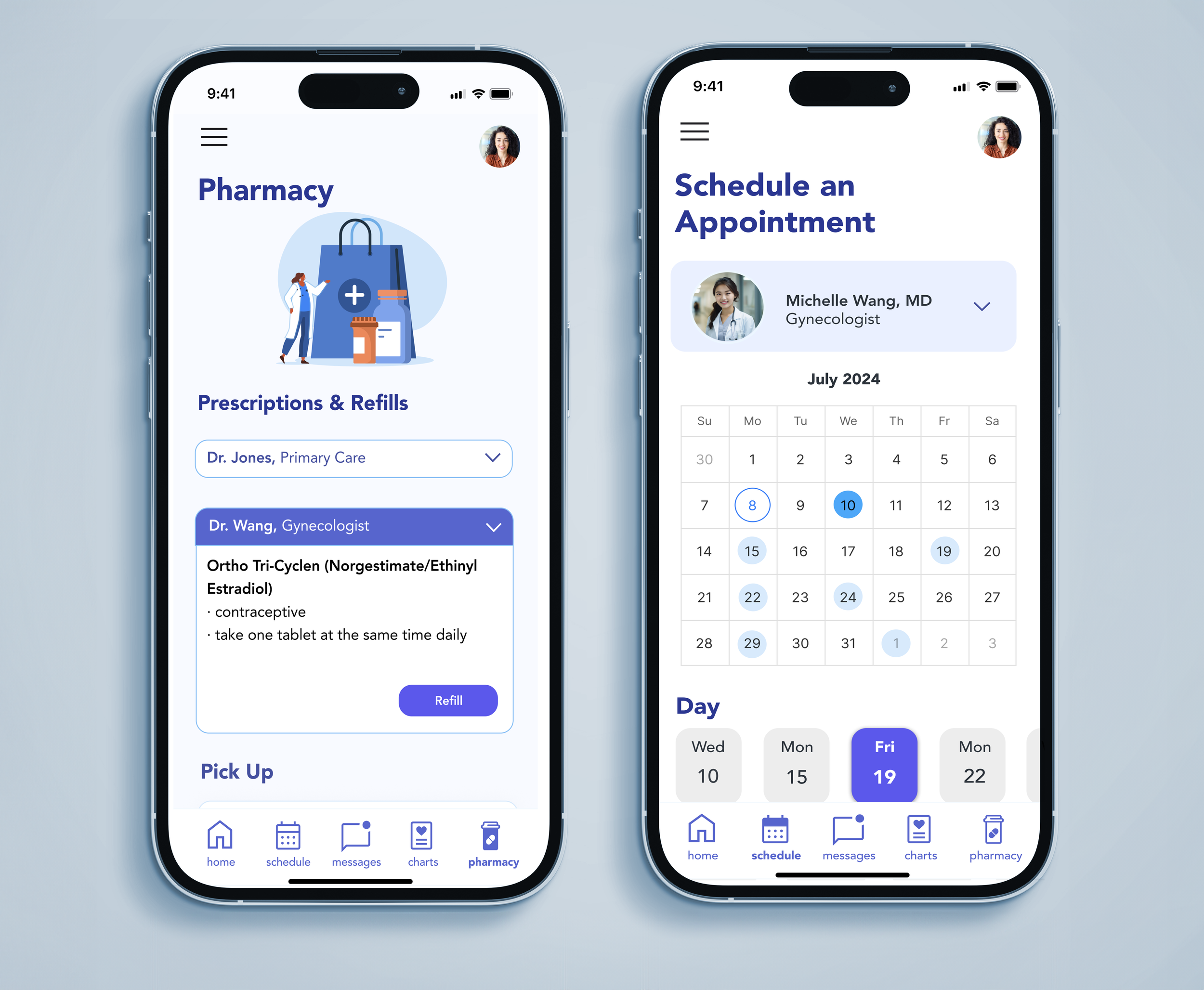
AppointRx
Product Design · UX/UI Design · Healthcare & Accessibility · Branding
A patient-focused app that simplifies appointment scheduling and communication with independent providers and pharmacies designed to reduce confusion and improve the healthcare experience.
-
![]()
Teamfight Tutor
Product Design · UX/UI Design · Visual Design · Branding · Gaming
Your TFT companion for game-winning guides and insights, designed and optimized for iPhone and iPad to help players climb with confidence.
-
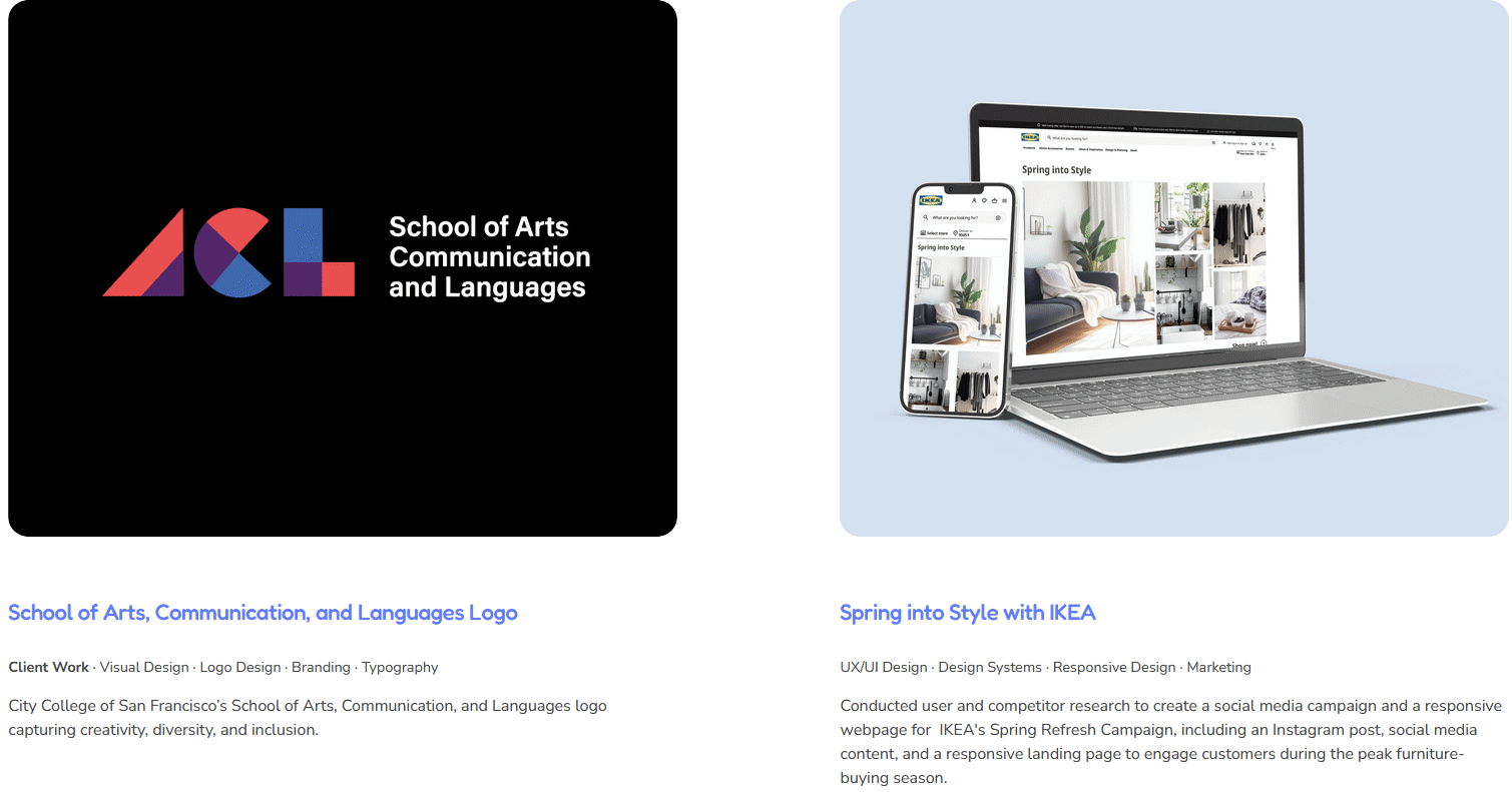
![]()
Visual & Graphic Design Projects
Client Work · Visual Design · Graphic Design · Branding · Typography · Marketing
Check out my visual design work!