Appointments. Prescriptions. Communication. Records. All in one place.
AppointRx
Role: UX Designer, UX Researcher, Visual Designer
Timeline: 3 Weeks (Completed in a 3 Week Design Sprint)
Team: Solo project, 0→1
Tools: Figma · Google Forms · Adobe Illustrator
INTRODUCTION
AppointRx is a patient-focused app that simplifies healthcare across independent practices.
I designed it end-to-end to solve a common problem: patients juggling multiple portals, inconsistent systems, and scattered records just to manage basic care. Through research with patients and healthcare workers, I uncovered pain points like confusing scheduling, refill delays, and slow communication. I translated these findings into streamlined flows that make it easy to book faster, refill with ease, and stay connected to doctors, all in one place.
THE PROBLEM
Getting care is difficult when your doctor isn’t part of a big hospital system.

Before this project, I experienced firsthand how overwhelming it can be to navigate independent care. Finding a doctor took weeks, and once I did, I had to juggle multiple portals, phone calls, and scattered records for even the simplest needs.
I found that patients experienced the same frustrations:
-
every clinic used a different system
-
booking often required phone calls
-
no clear process for prescriptions
-
visit notes were hard to access or download
-
nothing unified appointments, refills, and records
→ This project set out to make healthcare simpler with one hub for scheduling, refills, records, and communication.
THE SOLUTION


One hub for every part of your care.
Getting care at independent clinics was fragmented and frustrating. AppointRx is a patient-first app that turns healthcare from a chore into a clear, connected, and manageable experience.
What I built (based on research):
Book in seconds → Simple, step-by-step scheduling with instant confirmation
Refill without the fuss → One-tap requests and real-time updates from pharmacies
Chat like you already do → Direct, text-style messaging with providers
See everything at a glance → Unified access to visits, prescriptions, and records
How Patients Use AppointRx
AppointRx was built to turn frustrating healthcare tasks into smooth, everyday experiences. Here are the three core ways patients use it:
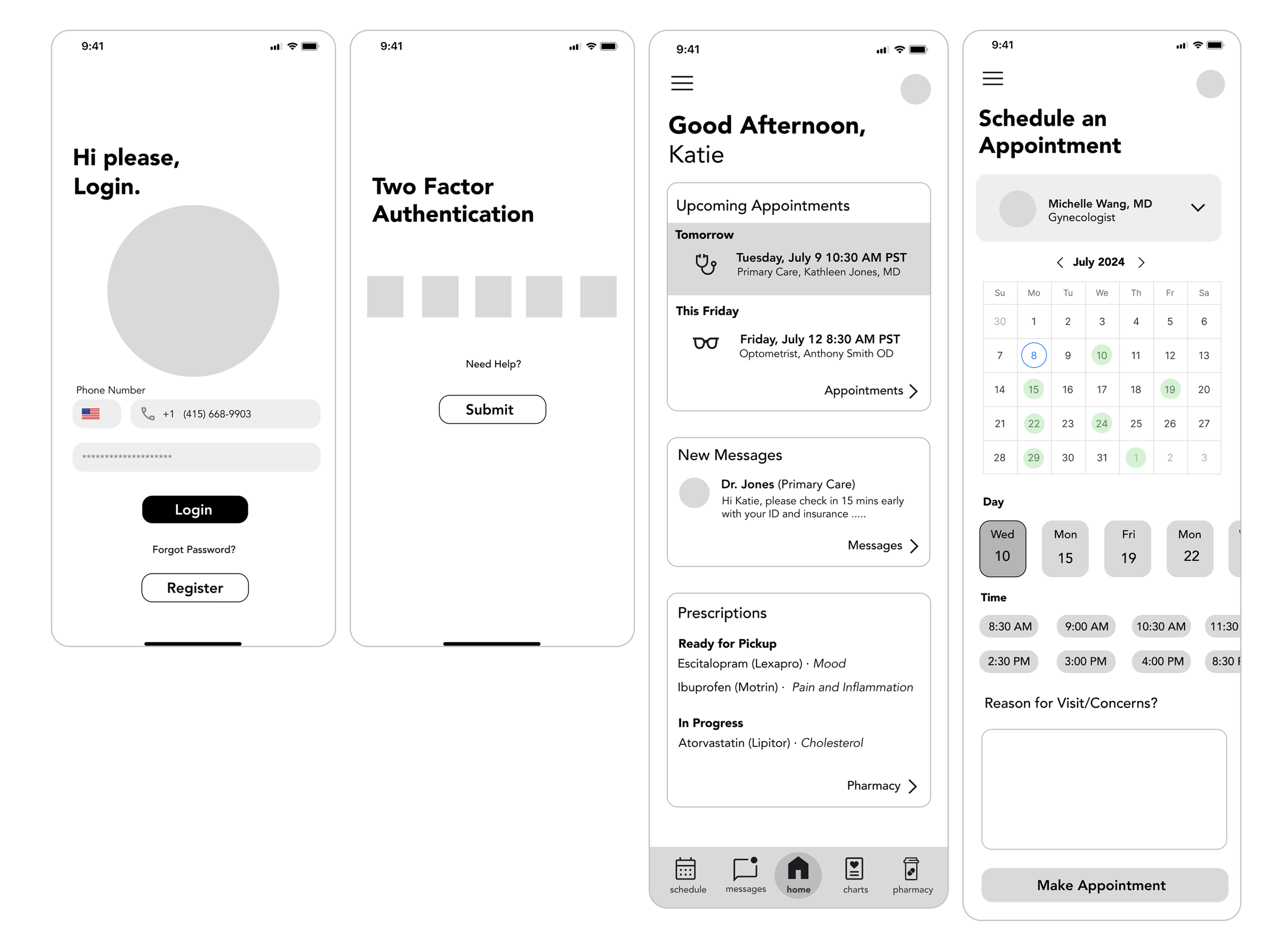
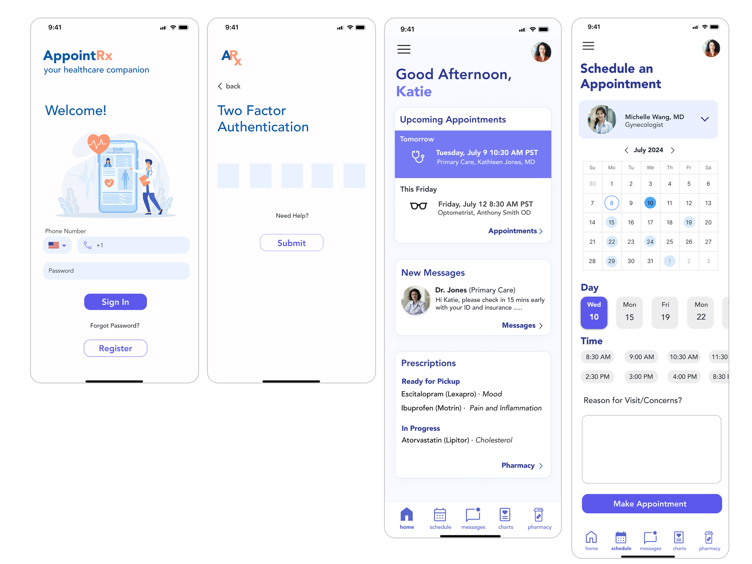
Log In & Make an Appointment

I designed the scheduling flow to remove the frustration of calling clinics or navigating multiple portals. The process became quick, secure, and intuitive, just a few taps from sign-in to confirmation.
Why it’s important
Patients struggled with inconsistent, phone-heavy scheduling systems across independent practices.
Why it matters
Appointments can now be booked in seconds, with fewer missed visits and less staff time spent on phone calls.

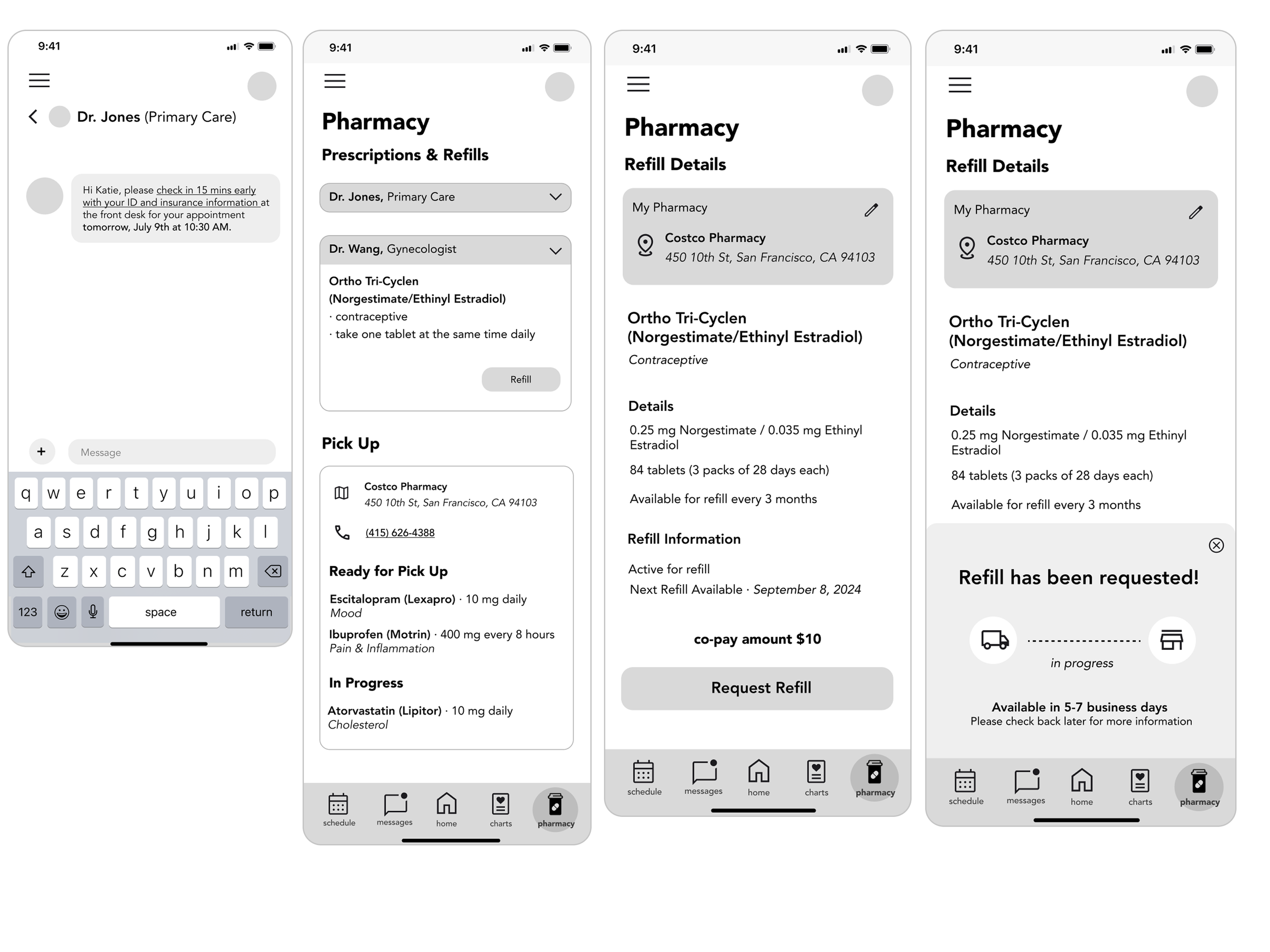
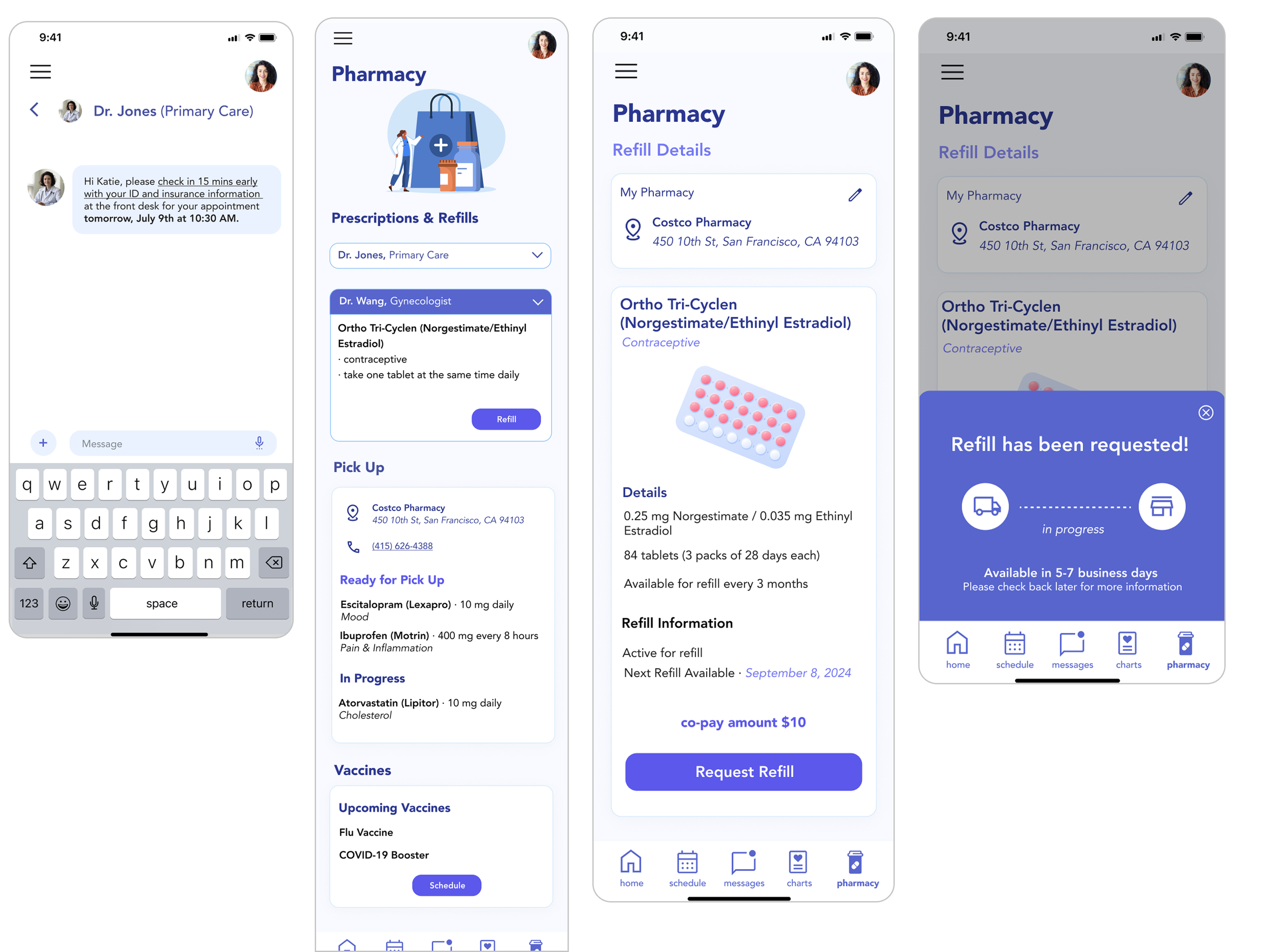
Refilling a Prescription
I designed the refill flow to make managing prescriptions fast, clear, and stress-free.
Why it’s important
Patients often miss or delay refills because every clinic has its own confusing, manual process.
Why it matters
A one-tap, transparent refill flow keeps patients on track with treatment and reduces workload for clinic staff.

Messaging & Easy Chart Access
I built messaging and chart access to make communication and health records easy to manage, all in one place.
Why it’s important
Patients struggle to get quick answers and often juggle phone calls, emails, and paper records.
Why it matters
A text-like chat and clear, centralized charts make communication feel natural and keep patients informed, while reducing staff workload.
-
Log In & Make an Appointment Key Screens

-
Refill a Prescription Key Screens

-
Messaging Doctors & Checking Charts Key Screens

VALUE & AUDIENCE

Built for Patients, Designed for Growth
USER RESEARCH & INSIGHTS
How I Gathered Insights
Surveys + 1:1 interviews with patients & healthcare workers
Focus: people using multiple independent providers or smaller practices
Goal: uncover gaps in scheduling, communication, and access
My Key Findings
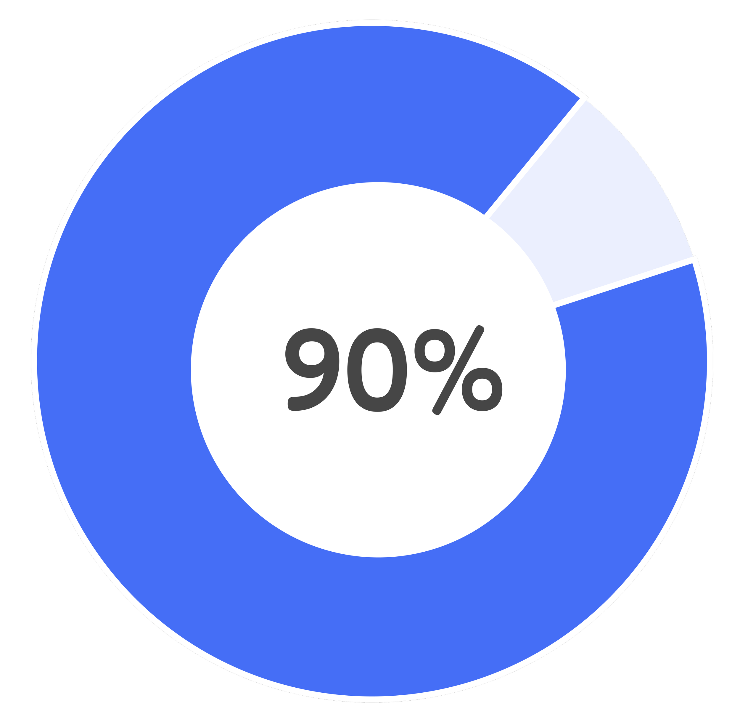
of patients said they want a single platform to manage healthcare
“While there are challenges to adopting centralized tools like cost, technical limitations, and security concerns the benefits for patient experience and practice efficiency are undeniable.”
— Primary Care Physician, San Francisco
I found two sides of the story …
Patient Frustrations
Scheduling is difficult without online booking
Refills are confusing, often delayed or unclear
Records are scattered, hard to access or download
Communication is slow, with long hold times
One central hub desired to manage appointments, refills, and messages
VS
Provider Concerns
High cost of new systems
Outdated tech infrastructure
Privacy concerns around HIPAA compliance
Risk of workflow disruption
Need for patient-friendly tools that reduce phone calls
So I designed AppointRx to address both patient frustrations and provider concerns
By listening to both sides, I designed a tool that:
Reduces no-shows with easy booking & reminders
Improves adherence with simple refill requests
Simplifies records access for patients
Supports independent clinics without requiring full system overhauls
Patient-first design with clear, friendly interfaces
Modular system that scales with future features and integrations
DESIGN PROCESS
Designing based on real needs.
From Ideas to Wireframes
I focused on making things feel familiar and effortless:
Booking appointments without phone calls
A clear refill process with step-by-step guidance
Messaging that feels like a real conversation
Records written in plain language
-
Lo-fi Wireframes
I started with low-fidelity wireframes to validate how patients would move through the app before focusing on visuals.
Why it matters: These choices directly responded to patient frustrations with clunky scheduling, refill confusion, and scattered records while also easing provider concerns about usability and security.
-
Design Choices
Appointments → Tap-to-select date/time for quick, intuitive booking
Refills → Card-based layout so patients can scan and request in one tap
Messaging → Chat styled like familiar apps (e.g., Facebook) for easier adoption
-
Hi-Fi Wireframes
After user testing, I refined the designs into high-fidelity wireframes.
The focus shifted from structure to visual clarity, accessibility, and trust, ensuring the app felt intuitive and reliable for patients and providers alike.
Why it matters: These refinements transformed AppointRx from functional wireframes into an experience that feels approachable, modern, and trustworthy—addressing both patient frustrations and provider concerns.
-
Design Priorities:
Clarity → clean typography, color hierarchy, and high contrast to reduce cognitive load
Consistency → familiar patterns like chat-style messaging and calendar-based booking
Accessibility → large tap targets, plain language, and simple visual cues
Delight → small illustrations and polished visuals to make healthcare feel less intimidating
Design System

Iterating with Intention


CONCLUSION
Reflection
AppointRx pushed me to think not just about user experience, but about real-world healthcare gaps. I learned to:
Design for accessibility, not just aesthetics
Simplify without stripping away important context
Communicate complex systems clearly and calmly
If I had more time, I would:
I’d test with users who are less comfortable with technology
Build a dashboard for providers to manage requests
Explore real-world partnerships with small clinics and pharmacies
What I bring: I design with care. I listen deeply, simplify what’s complicated, and stay focused on what actually helps people.
If you’re looking for someone who loves connecting user needs with thoughtful solutions, I’d love to chat!
More of My Design Adventures
-
![]()
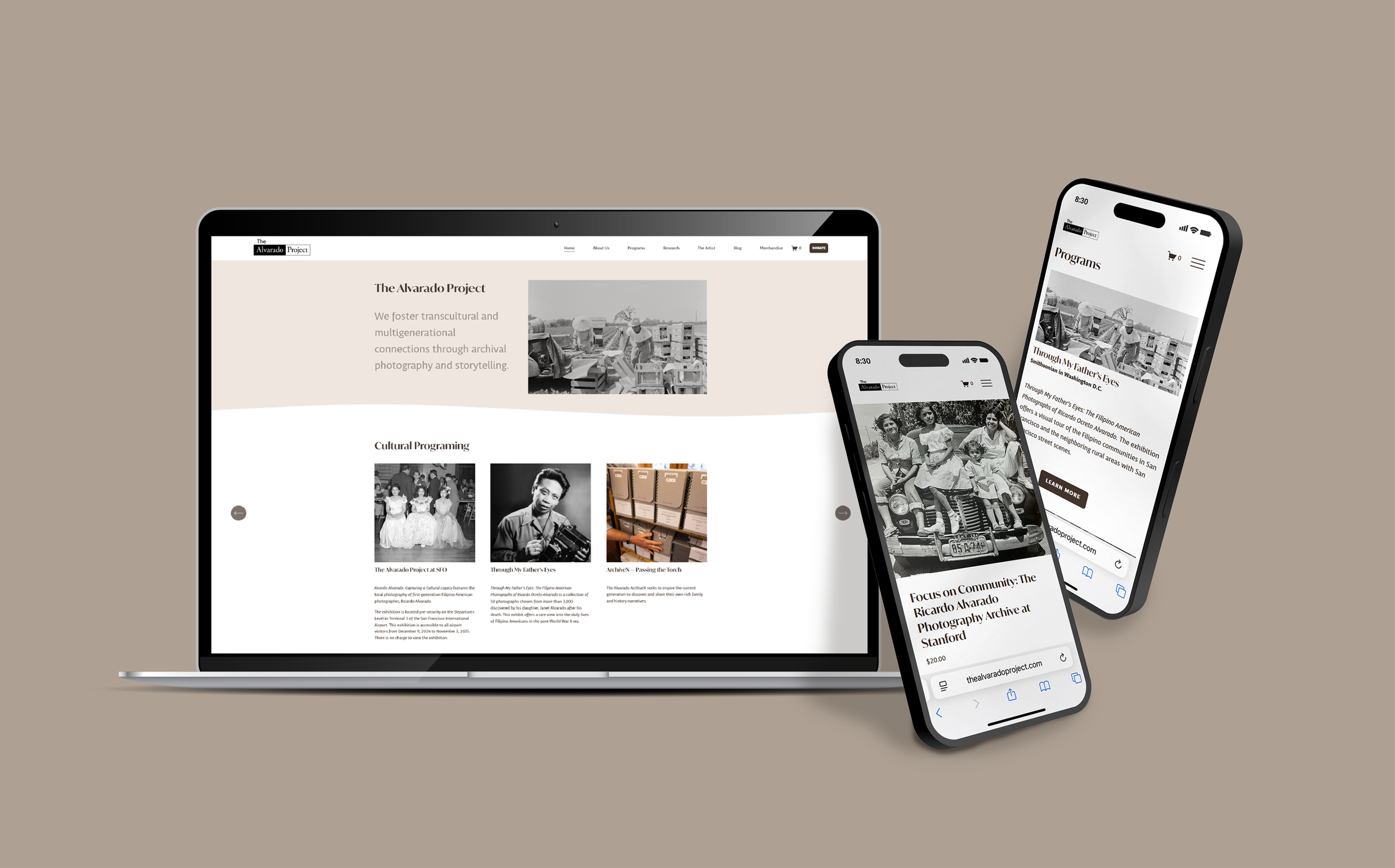
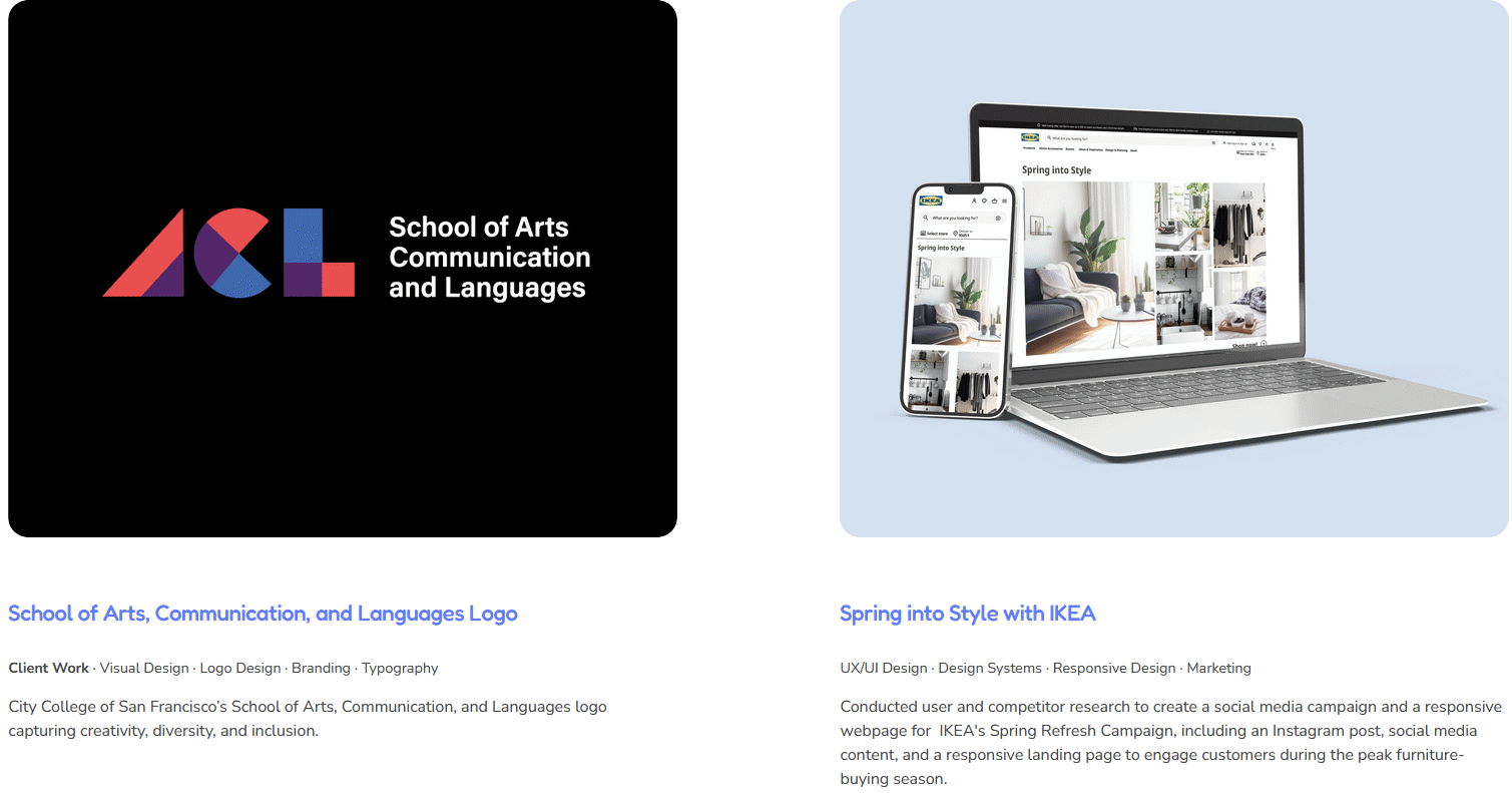
The Alvarado Project Website Redesign
Client Work · Product Design · UX/UI Design · Information Architecture · Content Strategy · Branding
Worked with and rebuilt The Alvarado Project’s site with a clear IA, integrated donate & shop flows, and a volunteer-friendly CMS, making the website engaging, shoppable, and easy to maintain.
-
![]()
Teamfight Tutor
Product Design · UX/UI Design · Visual Design · Branding · Gaming
Your TFT companion for game-winning guides and insights, designed and optimized for iPhone and iPad to help players climb with confidence.
-
![]()
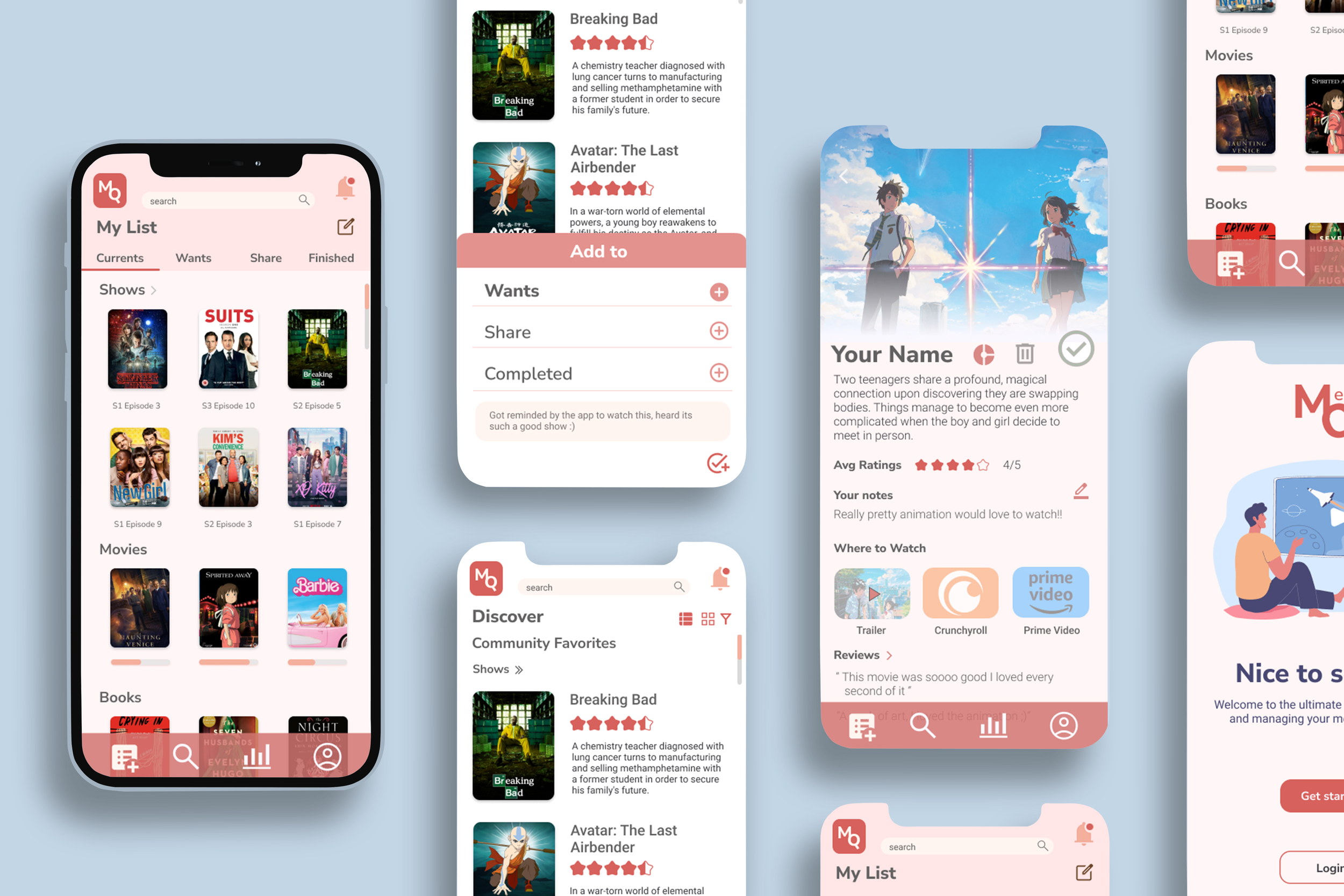
MediaQ
Product Design · UX/UI Design · Branding · Interaction Design
A simple, organized way to keep track of the movies, shows, and books you’re into. MediaQ lets you sort what you’re watching, what’s next, and what you want to share, all in one place.
-
![]()
Visual & Graphic Design Projects
Client Work ∙ Visual Design ∙ Graphic Design ∙ Branding ∙ Typography ∙ Marketing ∙ Social Media ∙ Story Telling
Check out my visual design projects!