MediaQ
Easily track movies, shows, and books — so you never forget a recommendation again.
MediaQ is a personal media tracking app designed to help users organize, remember, and revisit recommendations for movies, shows, books, and more. Inspired by the everyday frustration of forgetting what to watch or read next, MediaQ creates a space that feels intuitive, flexible, and built around real habits.
Role
UX Designer
UX Researcher
Visual Designer
Skills
User & Competitor Research
Wireframing
Prototyping
Branding
Timeline
8 Weeks
This project started with a familiar problem:
You know that moment when someone tells you about a show you have to watch? Or a book that’s “so your vibe”? You nod, promise to remember, and totally forget. That’s what kept happening to people I talked to.

Recs were scattered everywhere
Notes, screenshots, text, spreadsheets
No Context
People forgot why they saved things (or who told them)

List got stale
No updates, no excitement, just forgotten stuff

Tracking was messy
No clear system across apps or formats

→ Finding something to watch or read became more work than fun

The solution is MediaQ.
People didn’t need more features. They needed something that just works.
MediaQ simplifies the way people track media, letting users save, organize, and revisit recommendations across movies, shows, and books in one place.
Flexible lists for watching, reading, and sharing
No more juggling notes, screenshots, or texts. Everything lives in one space. Move items between list without friction.

A discovery tab shows new content regularly
Keeping lists fresh and helping users discover new media.

Simple, consistent tracking across all media types
One space for everything—no matter the format.

Managing your watchlist becomes seamless and fun
Less stress, more intention. Save the context—who recommended it or what caught your interest.

Prototypes and Flows
Key Flows
Onboarding
A simple onboarding flow walks users through creating their first list and adding an item—so they can start organizing right away, with no confusion.
Watching & Finishing Media
Users can move content between lists with one tap. Once marked as finished, they’re prompted to rate it and optionally add it to their To Share list.
1. Onboarding Flow
A Guided Start for First-Time Users
MediaQ’s onboarding was designed to help users jump in fast. This short flow introduces users to key actions.
Research showed users needed a simple, self-guided start. This onboarding gives just enough direction to help them dive in with confidence.
What Users See in the Flow
Welcome screen
Sets expectations and introduces the app’s core purposeDiscover Media
Users start organizing right away with trending mediaAdd an item
Tap a title, add it to a list, and add a quick noteExplore and manage
Navigate between lists and update items as progress changes
Onboarding at a glance
2. Moving Through the Watchlist
Users can mark progress, rate what they’ve watched, and easily share it with friends. The flow is designed to reduce friction. Fewer taps, clearer actions so users can stay focused on enjoying content, not managing it.
What Happens in the Flow
Mark as complete
With one tap, users move an item from Wants to FinishedRate and reflect
Add a quick rating or note after completionShare with friends
Instantly share a single item—or save it to a “To Share” list for later
From Watchlist to Shared at a glance
Who It’s For and Why It’s Different
Target Market

The media tracking space is growing, especially as platforms and content continue to fragment.
Over 214 million Americans stream video content
BookTok has made book discovery more social than ever
67% of users use multiple apps to track what they want to consume
There’s space for a simple, all-in-one tracker that meets people where they are.
Target Audience

While most media tracking tools focus on a single type—like movies or books—MediaQ is designed to handle it all, without the noise of social feeds or overbuilt features.
What makes it different:
Multi-format tracking — movies, shows, books, and more
Flexible lists instead of rigid categories
Personal context stays with every item (who recommended it, why it matters)
Built for solo use, not another social network
Stakeholders

As a solo project, I regularly gathered feedback from:
Friends and peers who track media regularly
Designers who use similar tools
Casual users are overwhelmed by cluttered tracking systems
If expanded into a real product, key stakeholders would include:
Product managers to guide feature prioritization
Developers to build integrations and ensure smooth performance
Marketing teams to reach different audience segments
Why We Stand Out

MediaQ is designed for:
People who regularly watch, read, or listen to media
Anyone using Notes apps, spreadsheets, or screenshots to stay organized
Users who consume across platforms—TV, books, movies, and podcasts
Those who want a clutter-free, private way to track media
Mobile-first users who value simplicity and speed
The Process
Bringing that vision to life meant grounding every decision in real user behaviors and needs. Here’s how I approached the design process—from early research to iteration and refinement.
1. Discover
Researched how users currently track media through surveys, interviews, and tool audits (Notes, spreadsheets, Notion). Identified key frustrations and habits.

2. Define
Mapped common needs like flexibility, context, and ease of use. Prioritized features that align with how people already manage media.
3. Design & Test
Sketched wireframes, built early prototypes, and tested flows like onboarding and list creation. Refined based on real user feedback.
4. Finalize
Built polished, high-fidelity screens with lightweight visuals and intuitive microinteractions—designed to feel effortless and familiar.
People want to track what they’re watching and reading until it becomes too messy to manage.
My goal was to:
Understand how people discover, track, and organize the media they consume.
Identify where current tools fall short to design a more seamless and personalized tracking experience.


To dig into this, I combined a few research methods
Surveys – 40+ responses from everyday media consumers
1:1 interviews – Ten open-ended conversations with users who regularly watch, read, and recommend content
Tool audit – Explored how people currently track things (Notes, screenshots, spreadsheets, Notion)
Behavioral Audit – Reviewed common tracking systems (Notes, spreadsheets, Notion, etc.)
Where Current Tools Fall Short (and What Users Actually Want)
56%
Currently do not track their media consumption due to inconvenience.
→ Existing tools are too fragmented or inconvenient.
“I’ve tried Notes, spreadsheets, even Notion but I never keep up with them.”
74%
Want their “to watch/read” content in a dedicated media-tracking platform.
→ Notes apps and spreadsheets aren’t cutting it anymore.
“I wish everything I want to watch or read was just in one place.”
52%
Who do track reported frustration related to forgetfulness, stale lists, or lack of context.
→ They’re actively looking for a better system to manage their media.
“My lists always turns into a wall of random titles. I stop using it.”
Competitive Analysis
Recognizing the crowded landscape of media tracking platforms, I identified critical differentiators for MediaQ:
Intuitive and simple user interface.
Integrated social features for easy sharing.
Flexible yet straightforward customization.
Comprehensive tracking without feature-limiting paywalls.
These insights guided the creation of MediaQ, emphasizing user-friendly design, personalized tracking, and enhanced media discovery.

Key Findings
Tracking is scattered
Users juggle multiple tools, none of which are truly built for media trackingContext gets lost
People forget why they saved something or who recommended itLists grow stale
Notes apps and spreadsheets rarely get updated, making discovery feel like a choreSocial discovery, solo saving
Content is often discovered socially, but saved privately many tools don’t reflect that
Design Process
Ideation
I sketched early concepts focused on flexibility, speed, and ease. The goal was to make tracking media feel lightweight, not like another task to manage.
Key ideas included:
Custom media lists
One-tap actions
Space for context
Format-agnostic design
These sketches laid the foundation for a flow that felt natural and easy to use.
Wireframes
I started with quick paper prototypes, then moved to low-fidelity wireframes to test core flows. From there, I refined the flows into mid- and high-fidelity designs, focusing on clarity, ease of use, and support for different media types.
Creating and customizing lists
Adding media with context (e.g. who recommended it or why its interesting)
Moving items from To Watch → Watching → Finished
Keeping the layout clean, mobile-friendly, and low-effort to update
Each round helped simplify the experience and reduce friction, without losing flexibility.
Low-fidelity: Defined the layout and key flows
Mid-fidelity: Refined spacing, structure, and usability
High-fidelity: Finalized interactions and visual polish for mobile
Low-Fidelity
Mid-Fidelity
High-Fidelity

Iterations
Based on user feedback, I made key changes to improve clarity and flow:
Simplified Landing → My List became the new home screen for quicker access
Streamlined Navigation → Moved recommendations to a Discover tab
Flexible Flows → Adjusted interactions to support different user habits
Added Onboarding → Introduced a simple setup flow to ease users in
Final Designs
These screens highlight a clean, cohesive interface designed to make media tracking effortless. Each list—Wants, Watching, Shared, and Completed—has its own view, making it easy for users to organize and navigate their content with clarity and ease.
Reflection
Designing MediaQ taught me that good design is about solving the right problem, in a way that respects how people already think and live.
This project pushed me to zoom out. I stopped asking, “What can I build?” and started asking, “What makes this truly useful?” I learned how to focus on outcomes, not just features. And I became more intentional in how I communicate the impact of my work, so the value is just as clear as the visuals.
Metrics
To evaluate MediaQ's success as a case study, these are the signals I’d track to ensure it’s delivering real value:
Engagement
Are users actively tracking content? How often are they returning?
Retention
Do people stick with it over time, or drop off after setup?
Adoption
Which features are being used, and which are being ignored?
Sharing Behavior
Are users passing along recommendations through the app?
Goal Completion
Are they achieving more of what they set out to accomplish?
These metrics wouldn’t just inform tweaks, they’d drive meaningful improvements based on real behavior, not assumptions.
What I Learned
Start with empathy
Deep research helped me design something users didn’t have to adapt, it adapted to them.
Cut the noise
People weren’t asking for more features. They needed a tool that removed friction and helped them follow through.
Design is strategy
This wasn’t just about UI, it was about shaping a system that fits user behavior and could scale with them.
MediaQ strengthened not just my skills, but my mindset. It made me a more focused, user-driven designer, someone who can think holistically and design with purpose.
If I Had More Time…
Broaden User Testing
Dive deeper with less‑tech‑savvy segments to make sure MediaQ feels intuitive for everyone.Platform Integrations
Experiment with syncing data from Goodreads, Spotify, or Letterboxd so MediaQ becomes users’ existing media habits.Phased Roadmap
Map out which features deliver the biggest early wins (favorites, tagging) and which can roll out later (social sharing, recommendation analytics). Consider freemium tiers or data‑driven monetization.Cross‑Functional Alignment
Partner closely with product managers and engineers to balance user needs, technical feasibility, and business goals, so every design choice drives impact.
More of My Design Adventures
-
![]()
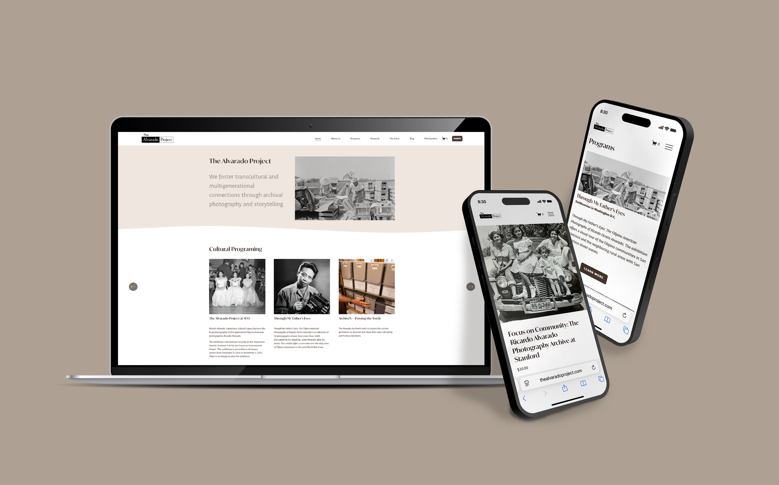
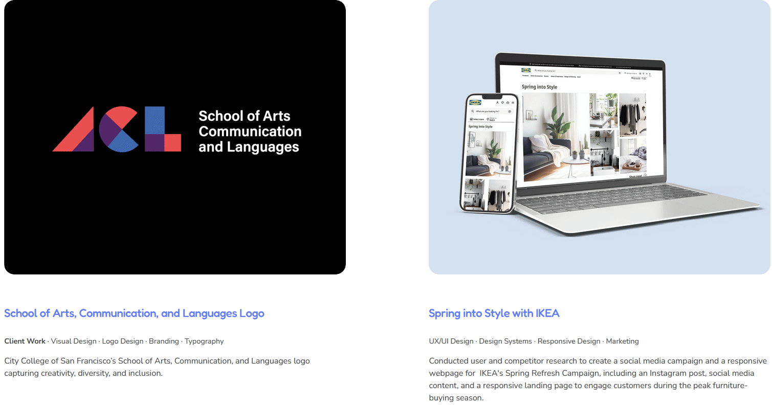
The Alvarado Project Website Redesign
Client Work · Product Design · UX/UI Design· Information Architecture · Content Strategy ·Branding
Worked with and rebuilt The Alvarado Project’s site with a clear IA, integrated donate & shop flows, and a volunteer-friendly CMS, making the website engaging, shoppable, and easy to maintain.
-
![]()
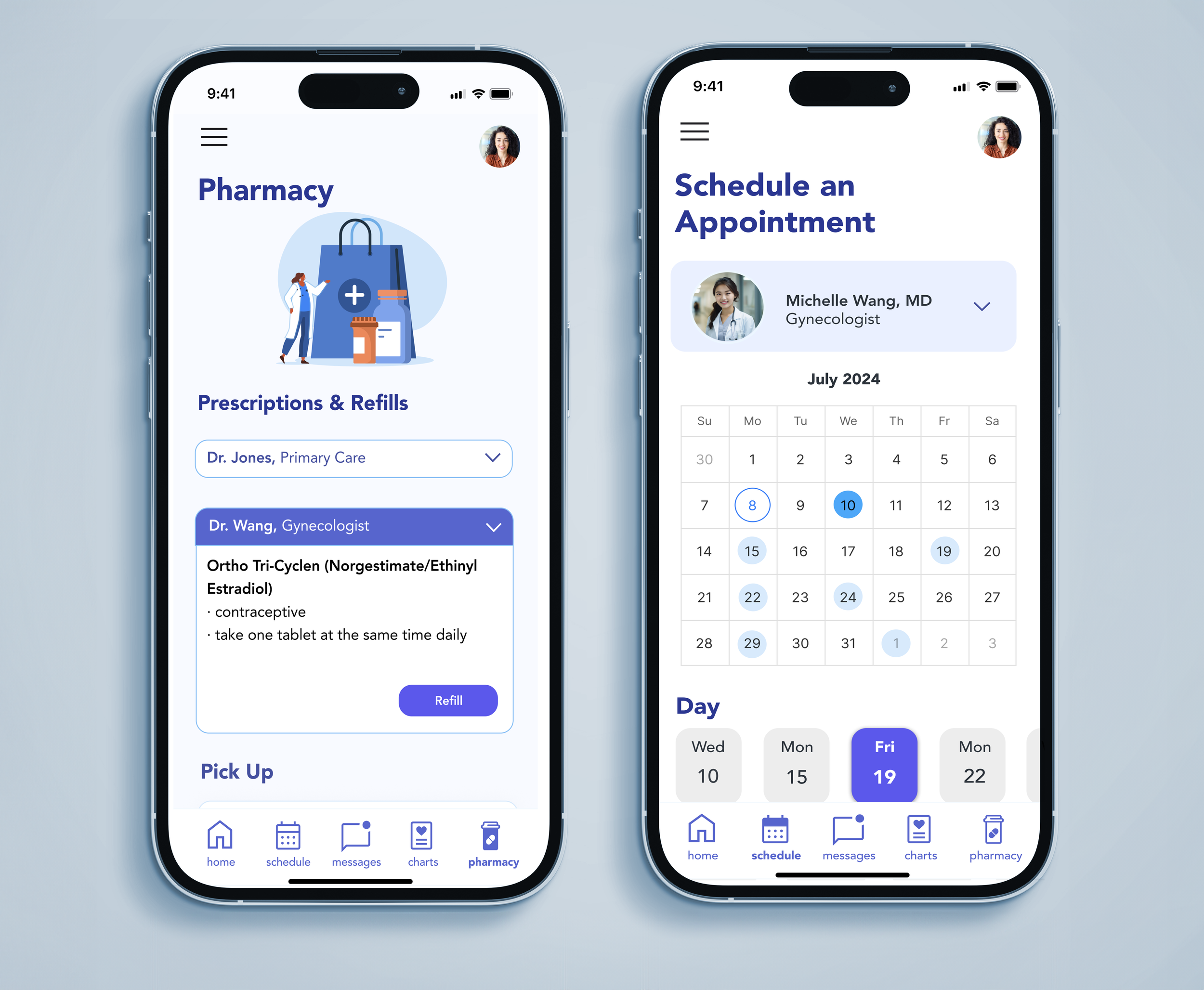
AppointRx
Product Design · UX/UI Design · Healthcare & Accessibility · Branding
A patient-focused app that simplifies appointment scheduling and communication with independent providers and pharmacies designed to reduce confusion and improve the healthcare experience.
-
![]()
Teamfight Tutor
Product Design · UX/UI Design · Visual Design · Branding · Gaming
Your TFT companion for game-winning guides and insights, designed and optimized for iPhone and iPad to help players climb with confidence.
-
![]()
Visual & Graphic Design Projects
Client Work ∙ Visual Design ∙ Graphic Design ∙ Branding ∙ Typography ∙ Marketing ∙ Social Media ∙ Story Telling
Check out my visual design projects!