Designing for Community
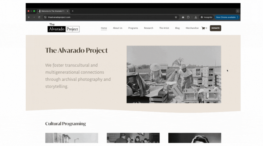
The Alvarado Project (TAP) is a San Francisco–based nonprofit preserving Filipino American history through photography and cultural programming.
I led the end-to-end redesign of their website to improve clarity, navigation, and long-term maintainability for a small, volunteer-run team.
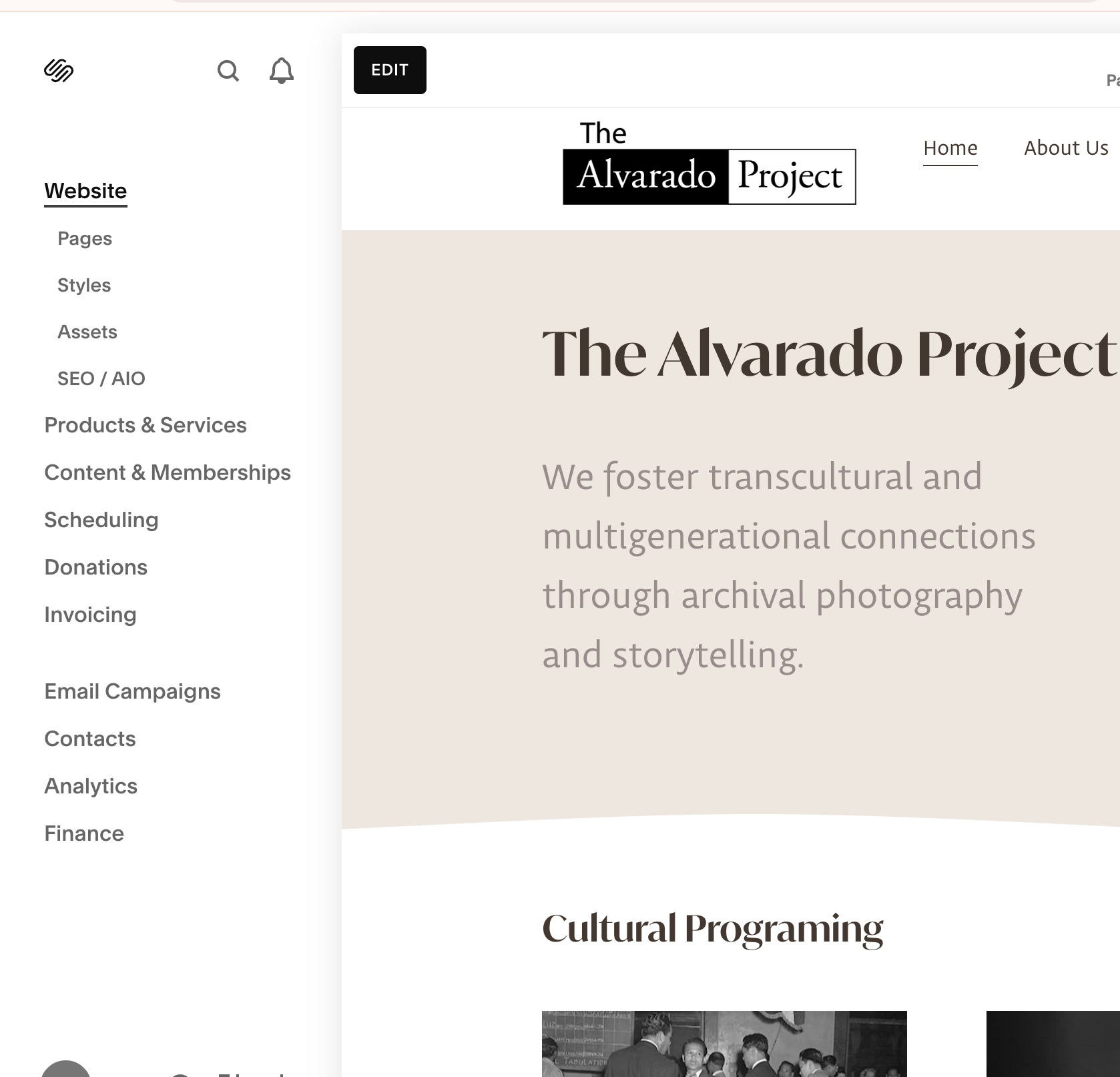
The Alvarado Project Website
Role
Lead UX/UI Designer
Squarespace Developer
Team
Me + 1 Content Editor
Tools
Figma
Squarespace
Timeline
Sept 2024 – May 2025
The Problem
When the story gets lost, support stalls.
TAP preserves Filipino-American history, but the legacy site buried the mission, was confusing to navigate and hard to maintain, limiting the organization’s ability to grow.
Navigation was broken
No clear way to support
Content went stale
Unclear messaging
We needed to rethink the structure, clarify the messaging, and make the site easy for their team to manage going forward.


The Solution

A website that works.
TAP now has a site that’s easy to navigate and update, with a structure that tells the story, surfaces Donate/Shop, and scales with their content. What I did:
-
I separated the nonprofit’s work from Ricardo Alvarado’s artist story, creating clear sections for the organization, exhibits, and the archive.
-
I built a clean, easy-to-follow site map with clear paths to explore programs, learn about the artist, and support the organization.
-
Added visible Donate button and built online shop for books + merch.
-
I rebuilt the site in Squarespace, so volunteers can easily update content, post events, and manage the shop without needing a developer.
-
I created responsive layouts, so exploring the archive, donating, and shopping feels just as smooth on phones as it does on desktops.
Key Interactions
Learn About TAP and the Artist
Clear separation between the nonprofit’s mission and the founder’s legacy prevents confusion, builds trust, and steers people to Programs or Support instead of bouncing.
Explore Programming
This is where mission becomes action, previews, dates, and CTAs route people to attend, read, or share, proving TAP’s ongoing impact and keeping visitors moving.
Donate
A persistent, low-friction Donate flow on desktop and mobile converts warm intent while it’s high; clear amounts and minimal steps reduce abandonment.

Purchase Merchandise
A clean shop with accessible checkout lets supporters contribute even if they’re not ready to donate and keeps the mission visible through books/merch.
Discovery & Research
Understanding our Users

We started by running alignment sessions with TAP’s team to understand their goals, audiences, and challenges.
From this, we created two personas to guide our design decisions.
What Wasn’t Working
The old site was messy and hard to use:
Key pages were buried in dropdowns that broke on mobile.
The donate button was easy to miss.
The site map was confusing, mixing programs and org info.
Visitors couldn’t tell what TAP does or how to support them.
Content Strategy & Information Architecture
Clarifying TAP’s story and simplifying how users navigate
Challenge
TAP’s old site blended organizational info with the founder’s biography, leading to unclear messaging and a scattered user journey.
→
We collaborated with TAP’s team to define two clear storylines:
The Organization — mission, programs, and community work
The Inspiration — Ricardo Alvarado’s personal story and photos
We used card sorting and user journey mapping to define a simple, logical site structure.
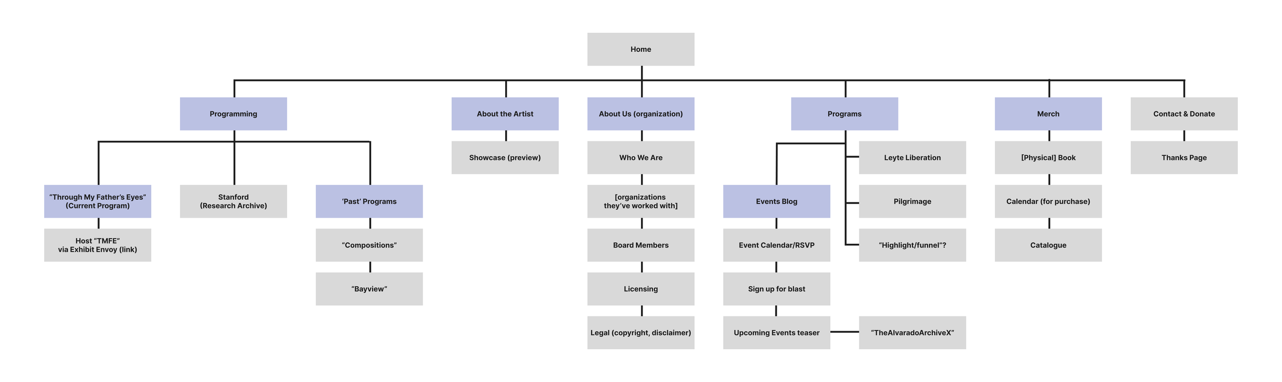
Leading to…
Nine clear navigation sections:

Design
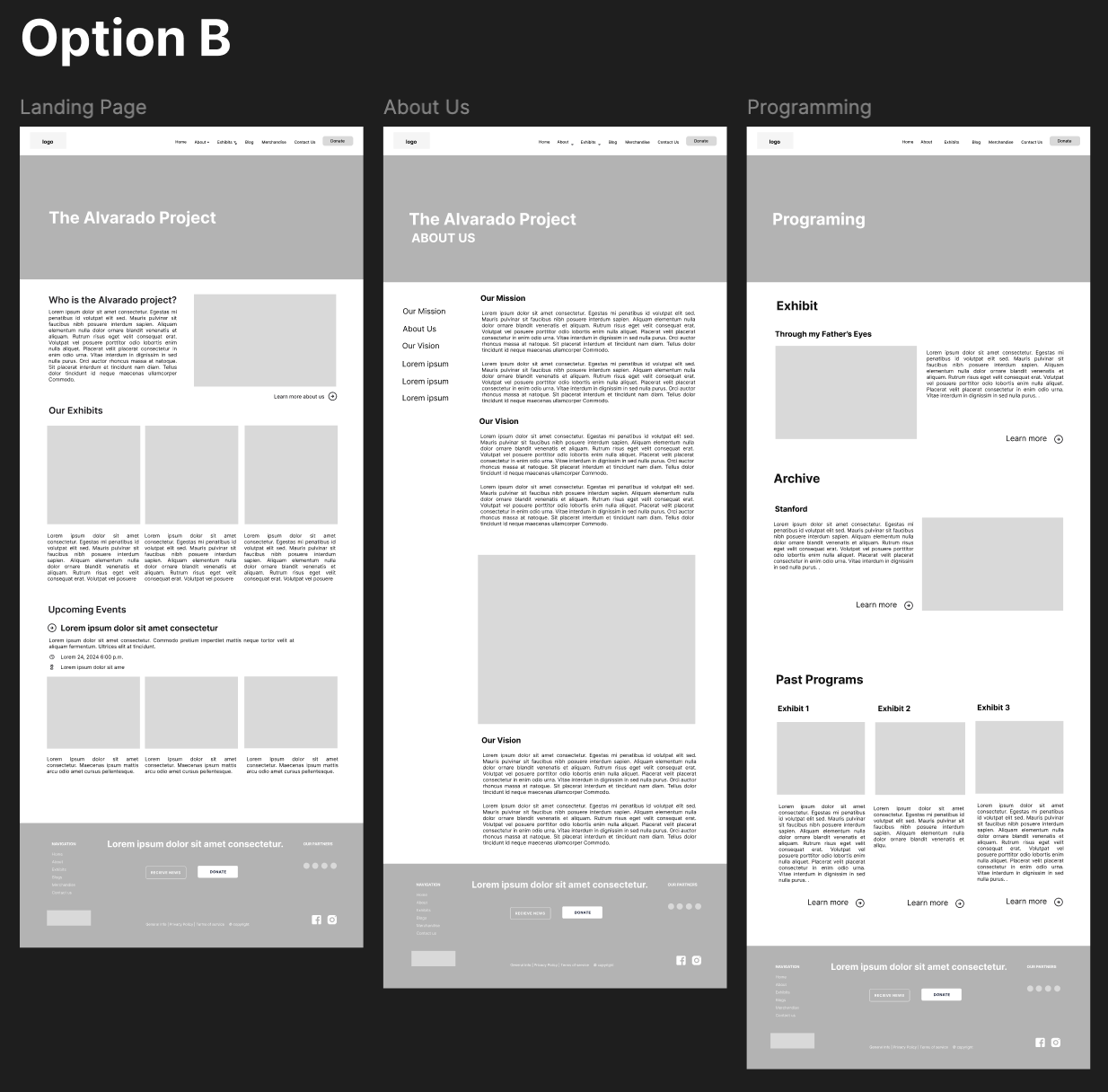
Wireframe Iterations
Explored two directions:
Option A → Simple structure, strong visuals, but risked oversimplifying history; actions like Donate were buried.
Option B → Clear donation, richer content, but risked clutter.
→
Final approach: Hi-Fi Wireframe combined both the clarity of A with the content depth of B.


This process didn’t come without challenges
Challenge:
Balancing the client’s desire to showcase as much archive content as possible with users’ need for clarity was a major hurdle. User testing revealed that the dense content made navigation confusing and diluted the organization’s purpose.
→

My Approach:
I led alignment sessions to show how restructuring the information architecture around supporter and curious visitor goals, not internal categories, improved flow for target users. This approach satisfied both the client’s vision and the usability needs of end users.
Example of challenge: redesigned programs page navigation to move from confusing categories (left) to a clear, goal-based structure (right)
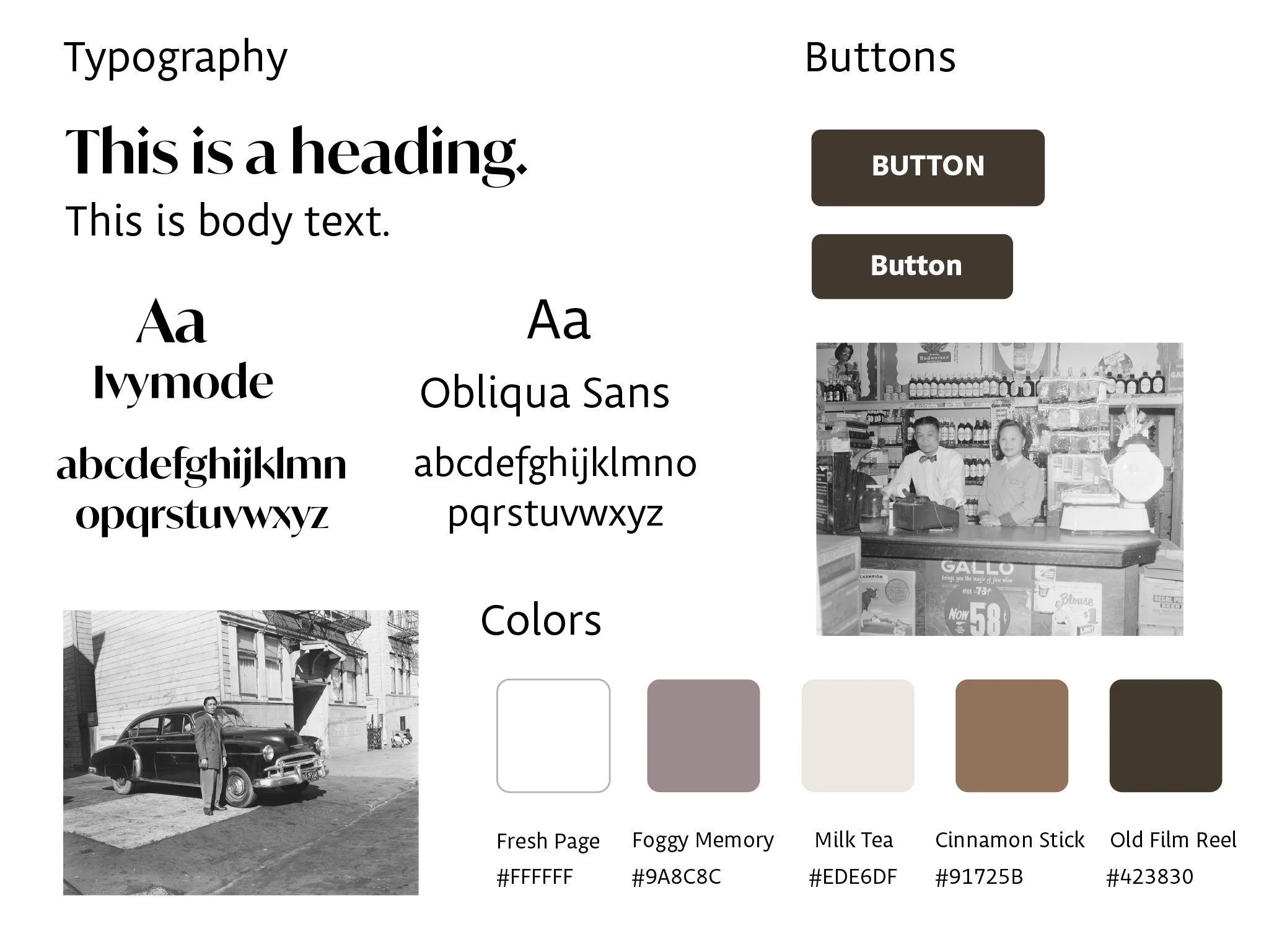
Design System
To keep the site cohesive and true to TAP’s mission, I created a design system defining colors, typography, and core UI elements.
-
Warm neutrals with soft accents, chosen to complement archival photography and convey community.
-
Serif headlines with sans-serif body text for a modern editorial feel.
-
Bold buttons as primary action components, ensuring visibility
Handoff
No-Code Build
We built the site on Squarespace so TAP’s volunteer team could manage it on their own:
-
for easily adding new programs, events, and merch
-
walkthorugh docs and videos
-
built to grow with their content and community
-
set up with built-in analytics so the team can monitor traffic, donations, and user behavior over time
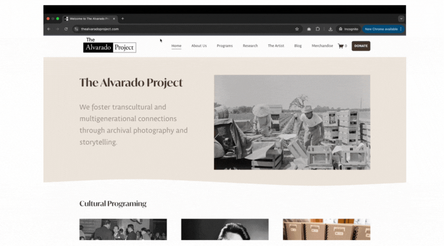
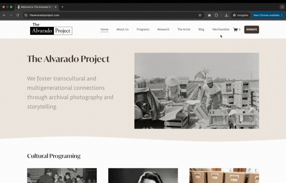
Before & After
Putting It All Together
Navigation Redesign
Reduced friction, make support options obvious, and align the site with TAP’s mission, creating a clearer, more accessible path for visitors to engage.

Programs Page
Renamed the Exhibits page to Programs to highlight TAP’s active initiatives. By focusing only on current programs, TAP’s work becomes clearer and easier for visitors to engage with.

The Artist Page
Highlighted Ricardo Alvarado’s story and photography, separate from TAP’s identity. Removed repeated exhibits, added context with captions, and kept videos as optional deep dives for those who want to explore more without breaking the flow.

Action-oriented Footer
Clean layout and clear calls-to-action (Social Media, Donate, and Newsletter signup). Removed unnecessary links and text to improve focus, accessibility, and user engagement.

Reflection
This project was more than just fixing a broken site; it was about empowering a grassroots nonprofit to tell its story with clarity and confidence. By separating TAP’s mission from the artist’s legacy, simplifying navigation, and surfacing key actions like Donate and Shop, the redesign delivered a site that better supports their outreach and fundraising goals.
The work demonstrated how thoughtful structure and accessible design directly influence how small organizations connect with their communities. Choices like renaming “Exhibits” to “Programs” and restructuring the footer weren’t just visual updates; they reshaped how visitors understood TAP’s mission and how the team could sustain it over time.
Projects like this reinforce my focus as a designer: building systems that reduce friction, amplify stories, and help organizations grow through experiences that feel effortless.
Why This Matters
This project gave TAP a website that’s clear, accessible, and sustainable. By separating the nonprofit’s mission from the artist’s legacy, surfacing key actions like Donate and Shop, and building on a no-code platform, I created a system that their team can manage independently. The result is a site that amplifies TAP’s story, makes it easier for visitors to engage, and frees the organization to focus on its community work.
More of My Design Adventures
-
![]()
Teamfight Tutor
Product Design · UX/UI Design · Visual Design · Branding · Gaming
Your TFT companion for game-winning guides and insights, designed and optimized for iPhone and iPad to help players climb with confidence.
-
![]()
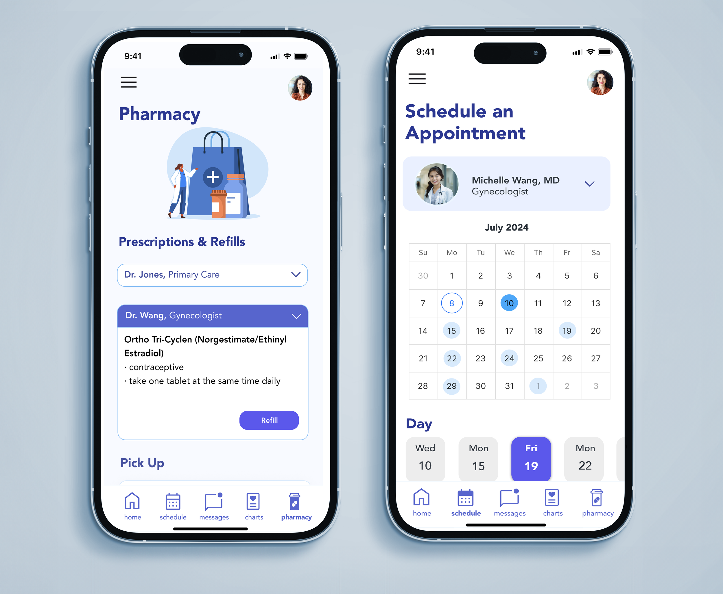
AppointRx
Product Design · UX/UI Design · Healthcare & Accessibility · Branding
A patient-focused app that simplifies appointment scheduling and communication with independent providers and pharmacies designed to reduce confusion and improve the healthcare experience.
-
![]()
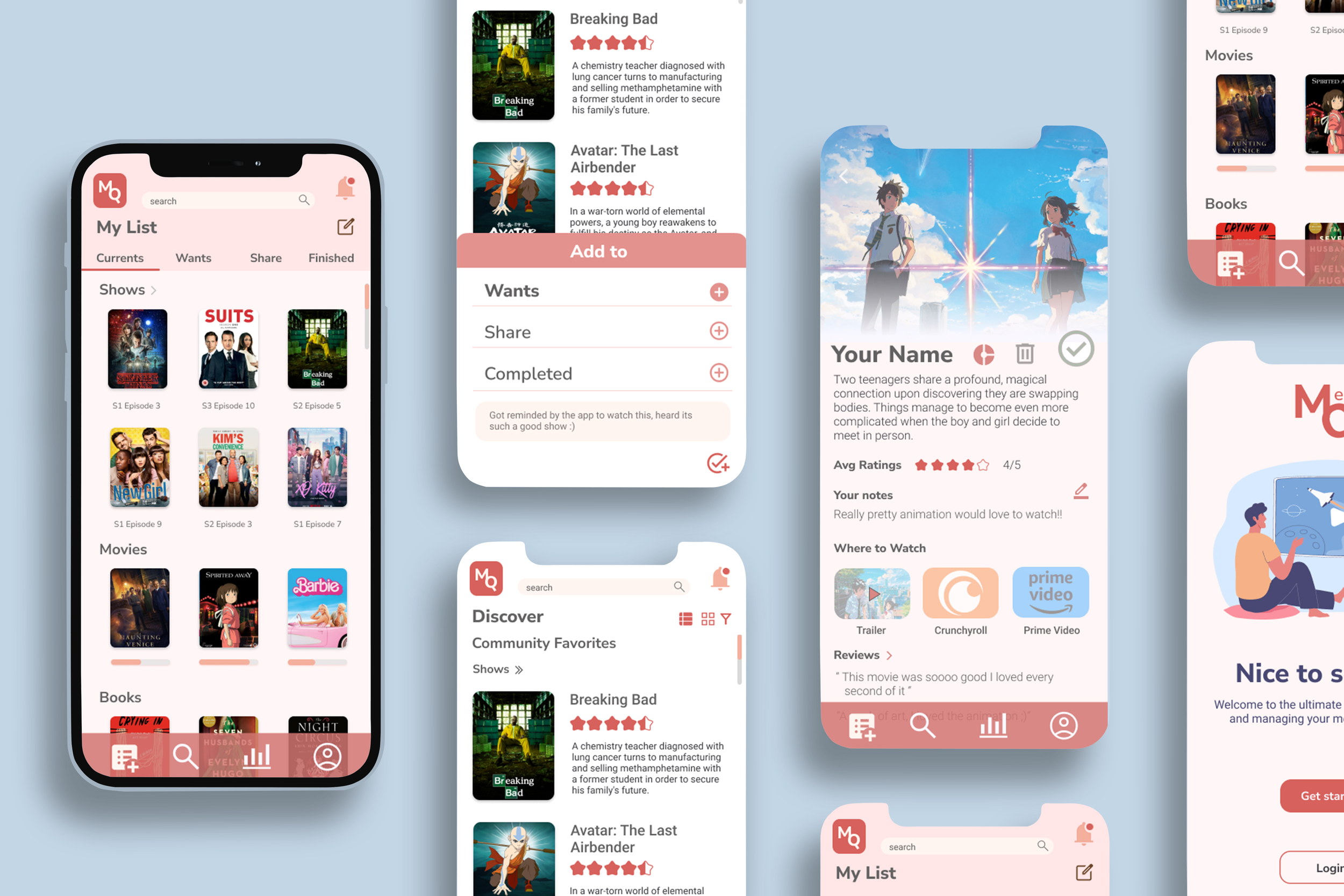
MediaQ
Product Design · UX/UI Design · Branding · Interaction Design
A simple, organized way to keep track of the movies, shows, and books you’re into. MediaQ lets you sort what you’re watching, what’s next, and what you want to share, all in one place.
-
![]()
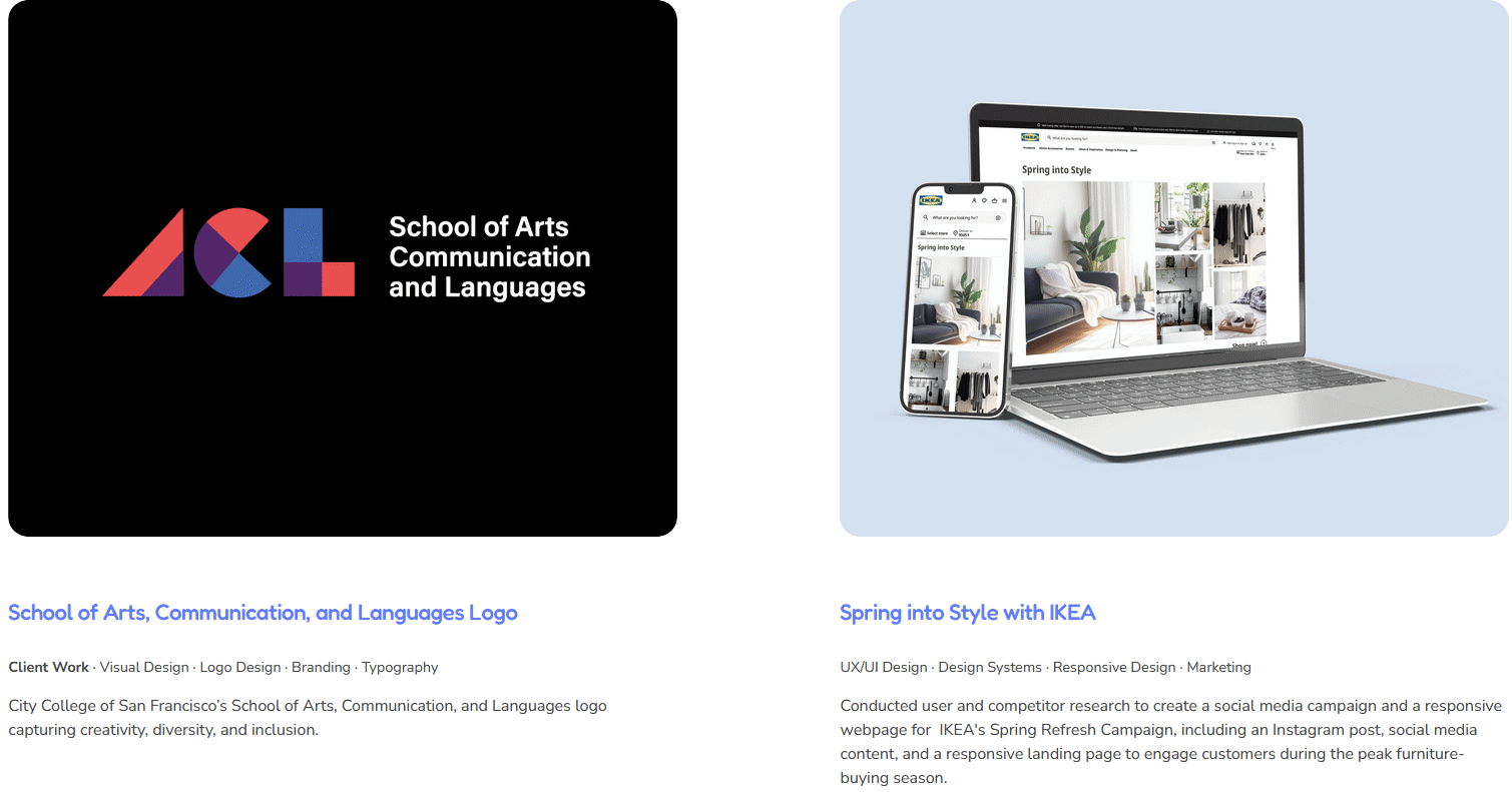
Visual & Graphic Design Projects
Client Work · Visual Design · Graphic Design · Branding · Typography · Marketing
Check out my visual design work!